(Archive) Advertising District / Dump-Place
-
 19-April 07
-

 RCTDude2316
Offline
RRP, on Feb 20 2009, 08:31 PM, said:

looks nice robbie but i dont like the white wood wall of the building at the far right of the screen
Im now working on a thriller/texas tornado pic1 pic2 travelling coaster but i cant seem to get the double loop right.I have 2 examples here.Anyone have any suggestions or ones they prefer
I wish I saw this earlier, check my link of Zonga (in my sig) which I made, ALONG time ago. -

FullMetal Offline
@BelgianGuy: I like the colors, and I like the path layout. I don't like the supports though. They look realistic, but IMO, realistic supports tend to look cluttered in RCT2.
@SSsammy: If it's supposed to be an El Loco, then I don't see it. It does look nice, though. It would look even better in a full-scale park.
I remember posting something about Le Tonnerre's last screen... I guess I forgot. Despite the fact that I already submitted it, I guess I could show that last screen...

BTW, be on the lookout for Kalakumo... -

 Goliath123
Offline
good thing i didnt download it then...
jokes, it ok, could use some more ground texturwe though. -

 turbin3
Offline
^yeah, you could use more ground textures.
The coaster looks good, but I don't like the foliage so much. -

 Comet
Offline
Ha, that reminds me of something I did awhile ago with a farm-themed coaster.
Check out the first screen in this thread. -

 Midnight Aurora
Offline
Xin, your work is always simple and elegant for what it is. But beyond the surface level, there's not much to look at.
 -

 SSSammy
Offline
dont put gravy in a kettle.
it seems like a good idea at the time.
now im gonna have t go to the shops tomorrow.
Top Gun, its kind of square. unatractive. try and smash it up abit. some more toof variation. even making it L shaped would make it better.
FullMetal, that screen would be brilliant if the foliage was a little better. right now its just amazing. -

 Nokia
Offline
^i like the look of the coaster, but the foliage sucks and your buildings are too boxy
my turn: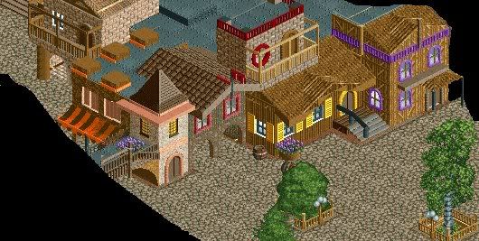
the black parts i don't want you too see yet.
slightly unfisnhed.Edited by Nokia, 13 April 2009 - 08:43 PM.
-

 JDP
Offline
Nokia, I would have to say your work is... good.
That's the only thing I can really say about it. It's not bad, just good.
-JDP -

 SSSammy
Offline
nokia, they look very pleasant,
but with the wooden building on the right,
its kinda all wood, if you could like put art decoedges on it it will be so much better.
good work anyhooo. -

 SSSammy
Offline

unfinnished.
feedback apreiciated
EDIT: PISS! forgot some foliagaryEdited by SSSammy, 14 April 2009 - 09:23 AM.
 Tags
Tags
- No Tags

![][ntamin22%s's Photo](https://www.nedesigns.com/uploads/profile/photo-thumb-221.png?_r=1520300638)
