(Archive) Advertising District / Dump-Place
-
 19-April 07
-

 Maverix
Offline
Nokia it looks very nice, but like SSSammy said, that building in the center is not looking too good.
Well I went back and fixed up the things you guys told me. So here...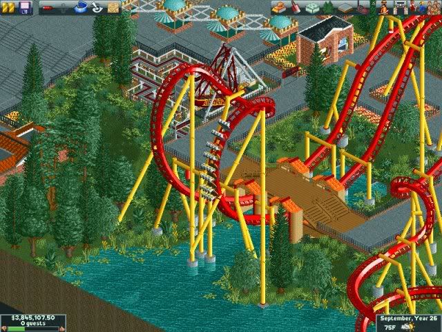
And here's a new one...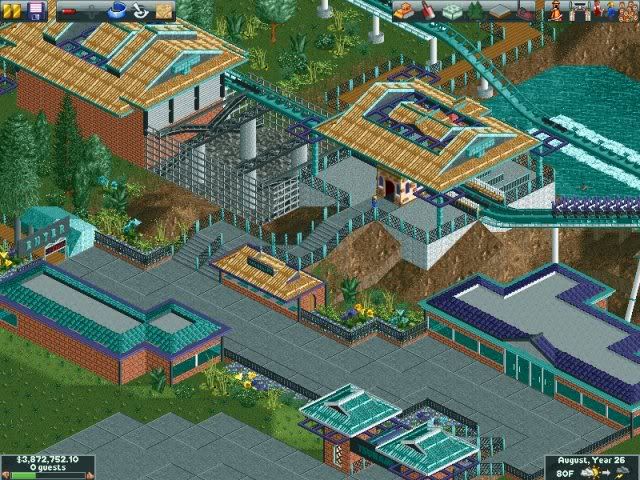
EDIT: Woops, I forget to zero-clearance the water up over the footer.Edited by Maverix, 02 April 2009 - 02:22 PM.
-

 nin
Offline
MMW much?
and there's not much improvement color wise... everything is that bland shade of green. -

 SSSammy
Offline
brilliant.
the second screen seem s to be missing something though.... i think it mught be the foliage...
or it might be the size and height difference.... -

 Lloyd
Offline
lol i thought of MMW too. Looks good anyway, although the orange in the first screen is too bright.
 -

 Camcorder22
Offline
Bleh, I always hate it when a water colored coaster goes over water. Might want to try some other colors, unless you really like it like that.
 -

 Louis!
Offline
^Yeah agreed. Thats the only thing I dislike about the screen. The rest is nice. Simple yet quaint.
 -

 Maverix
Offline
Camcorder22: I take it you hate that because it's hard to see the track? If so that was what I was going for there. I think it fits the rides theme nicely.
 -

 Gwazi
Offline
if he hates it for the same reason i do, its because it looks like a cheap way of trying to hide the track. either don't try to hide it or actually make it invisible.
the rest of the last two screens you have shown are pretty nice, though. -

 Brent
Offline
Gwazi, on Apr 3 2009, 03:41 PM, said:

if he hates it for the same reason i do, its because it looks like a cheap way of trying to hide the track. either don't try to hide it or actually make it invisible.
the rest of the last two screens you have shown are pretty nice, though.
That would just be ridiculous to make a coaster track invisible.... in that situation.
And nice new screen.... but kinda worried about the squareness of that building... -

 Gwazi
Offline
so no like track going through the water or anything? im talking like SheiKra here. nevermind tho, as i cant explain it right
 -

 eyeamthu1
Offline
Goliath - I really like that. Something about the placement of all the elements of that screen; the drop, loop and bridge - coupled with the landscape interaction... it gives it a really satisfying feel.
 -

 Liampie
Offline
I think I didn't post these screens yet on NE:

Theming is random and below my standard, as I made it for a contest and I knew I could beat my opponent quite easily.Edited by Liampie, 04 April 2009 - 01:12 PM.
-

 Comet
Offline
To many yellow flowers all over the place in my opnion.
I really like the layout though, especially the first drop, that'd be really fun. -

 Video_Kid
Offline
Just want an opinion.
*Colours are matched exactly to coaster and trains*
It isn't much, just a station for a Floorless coming up.
Thanks
AdamEdited by Video_Kid, 04 April 2009 - 10:40 PM.
-
![][ntamin22%s's Photo](https://www.nedesigns.com/uploads/profile/photo-thumb-221.png?_r=1520300638)
 ][ntamin22
Offline
interesting. Since its a floorless, might i suggest leaving some room for the raising/lowering floor sections?
 Tags
Tags
- No Tags


