(Archive) Advertising District / Dump-Place
-
 19-April 07
-

 RCTNW
Offline
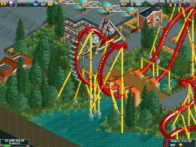
Very nice. It does look like you are missing a footer though in the bottom right of the cobra roll.
Love the colors
James -

 Brent
Offline
Absolutely beautiful. Love the colors... the bridge over the entrance/exit of the Cobra Roll. And the park entrance/ticket selling things (name's escaping me right now) also looks rather nice. Can't wait to see more.
 -

 zodiac
Offline
that's very good. the tunnel entrances/exits seem a little thick, though, but i'm just getting picky. it's great.
 -

 nin
Offline
The one real thing that needs work is the foliage, it's all the same. Other than that, it's very nice. You've improved.
 -

 Comet
Offline
Other then what's been said I'd change the fence around the path.
It's really pretty good though, well done. -

 Alpengeistfan1
Offline
Attempt at a diner:
Still not that good at buildings and what not, so please don't bomb it with complaints.Edited by Alpengeistfan1, 01 April 2009 - 05:47 PM.
-
![][ntamin22%s's Photo](https://www.nedesigns.com/uploads/profile/photo-thumb-221.png?_r=1520300638)
 ][ntamin22
Offline
not bad. the roof could use some simplification - maybe don't have overhangs on every single window? It might look better with a peaked roof.
 -

 Maverix
Offline
Wow, I wasn't expecting so many great comments from so many great builders. Thanks a lot.
But let me just make sure I know the little things I need to fix.
-Foliage
-Path Fence
-Footer on bottom left of CR
-8 Cars for the coaster
I'll go back and fix those things up as so as I can. I should hopefully have another screen ready in a few days too. -

 robbie92
Offline
Yeah, you've definately improved. The entrance booths look a little familiar
 , but the colors are great. I'm not a huge fan of the tunnels under the bridge, but i think they'd look better if you make the whole bridge in that style. Also, I don't like the different colored flanges on the supports. Other than that, it looks awesome. I look forward to seeing what you can do...
-

 Goliath123
Offline
Maverick that reminds of the coaster that Geewhzz and disneylhand did a wile back.
 -

 Maverix
Offline
^Yeah I know it looks like El Encierro, but all my inspiration for the coaster came from Silver Bullet.
Robbie: For making the bridge the same stile as the tunnels i take it you mean just fill out the empty space underneath. Just want to be sure. And thanks. -

 SSSammy
Offline
OH MY JESUS FLOATING CROOS BEAMS
the only bit i dont like so much is the building in the centre. -
![][ntamin22%s's Photo](https://www.nedesigns.com/uploads/profile/photo-thumb-221.png?_r=1520300638)
 ][ntamin22
Offline
pleasant. while it works well enough here i don't think an entire park of buildings like that will look very good.
 Tags
Tags
- No Tags
