(Archive) Advertising District / Dump-Place
-
 19-April 07
-

 w33maniac
Offline
63 years of playing or is there something else too? Can't wait to see. Anyway, those two poles standing up where can you get them, just thought I'd have some use for them.
w33maniac
Offline
63 years of playing or is there something else too? Can't wait to see. Anyway, those two poles standing up where can you get them, just thought I'd have some use for them.Edited by w33maniac, 28 June 2007 - 04:06 AM.
-

 Turtle
Offline
Fatha, I think there's too many poles serving no purpose. Also the foliage doesn't really work for me. Looks good though and tasteful use of windows.
 -

Fatha' Offline
^The poles serve a purpose, they are mosty architectural elements...
A couple of pieces of pole dont serve a purpose tho, like the ones on top of the gate tower (where one is bron and the other dark brown)...prolly gonna figure out somethin else to put there. -

 Midnight Aurora
Offline
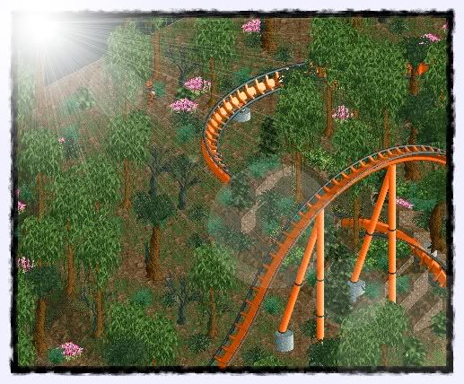
The photo editing is wonderful, woofenskid. The rest is pretty boring and uninspiried.
 -

 Comet
Offline
I like that screen a lot woofenskid.
The barrel roll has good interaction, the supporting looks nice, and I love the tiger entertainer in the forest. -

 woofenskid
Offline
Jesus.. that took forever to get it the way i wanted it, too. I'm not very good at the whole jungle thing, which is why i'm doing this, it's sort of a tiger/jungle themed design called "king of the Jungle" for now, I'll think of something more original later. The photo editing is basic, really.
Same shot, different angle.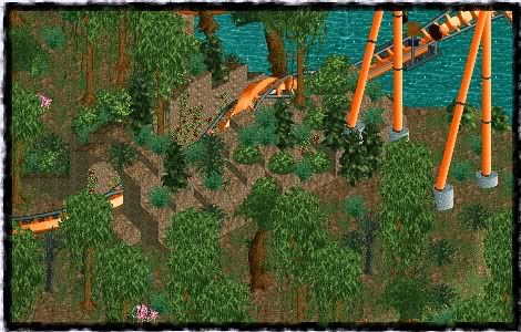
Edited by woofenskid, 28 June 2007 - 11:34 PM.
-

 tracidEdge
Offline
don't be so generic. also a jungle would have much thicker foliage than that, for sure.
 -

 Lloyd
Offline
^ Yeah that's true, thicken the foliage up alot.
Also, i do think that orange track and orange supports look bad. The track colours are nice it's good to see a vibrant colour, but then when the supports match it doesn't complement the track at all. -

 JDP
Offline
^I agree.
Also, try to make your landscaping flow a bit more because right now it is just the hilly piece of land that the coaster goes through.
-JDP -

 woofenskid
Offline
I'll see what I can do, I have to get back to my home computer before I can work on it.
 -

 zodiac
Offline
It looks so flat. Try making some landscaping adjustments, even where the coaster isn't.
 -

 Regulatin
Offline
If only you guys knew... good one Bob.
Funny thing is, people still think it's amazing. You probably would've won.
-

 CedarPoint6
Offline
I remember looking forward to that one when you showed the screen a while ago. I WANT to see that park ingame very badly now.... looks excellent.
 -
![][ntamin22%s's Photo](https://www.nedesigns.com/uploads/profile/photo-thumb-221.png?_r=1520300638)
 ][ntamin22
Offline
The photo editing is wonderful, woofenskid. The rest is pretty boring and uninspiried.
i've seen pbob's before.
er. maybe last PT? or the one before that?
fatha- not much to say. i don't like the foliage- that one light green tree in particular looks out of place.
muuuh- too many textures, too little actually-something-cohesive going on
pineapple- intruiging but lackluster. nothing jumps out at me that makes me go "ooooh, must watch this one" -

 Leonardofury
Offline
^Thanks, plus I do know how to spell Chronicles. However the retarded spelling fits better with the overall theme.
posix - Thankyou.
muuh - The colours in this section are meant to be drab and less vibrant.
Ah, a Kumba themed land!
 Tags
Tags
- No Tags
