(Archive) Advertising District / Dump-Place
-
 19-April 07
-

 RRP
Offline
Thats good work there RRP, is it going to be fully custom supported?
yep,the screen was basically to show the concept screen idea -

 Fr3ak
Offline
Looks really great what you did there RRP
only the catwalks look a little shitty atm, way to far away from the
track itself. -

 Louis!
Offline
I almost fell off my chair into a bath full of custard.
Now you know how ridiculous those comments were
It's nice but if you do what I suggested it would be uber fab. -

 Louis!
Offline
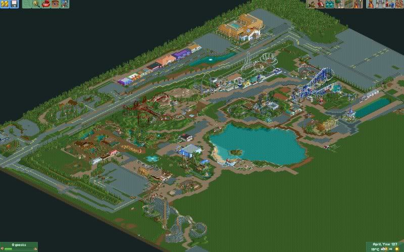
Just me & Airtime. Its about 3 years old, Airtime started it about 3 years ago and left it unfinished which then resulted in me picking it up, leaving it and now picking it back up again.
I'm sure Airtime will help me with this at some point. -

 Todd Lee
Offline
I really like the looks of certain areas of that, it could use some elevation changes and hills though. Kudos to you for keeping the park alive. It's not easy working on a dated park, you have to fight the temptation to scrap it and work on a new bench with different objects.
 -

 Todd Lee
Offline
I actually like it, other than the building on top of the top hat. It looks like you put it there, just to have something there.... The supports underneath look better, but they still don't look right.
 -

 Cocoa
Offline
austin powers, whats with the stairs on the building in the top left? i don't get it...
 Tags
Tags
- No Tags


![][ntamin22%s's Photo](https://www.nedesigns.com/uploads/profile/photo-thumb-221.png?_r=1520300638)
