(Archive) Advertising District / Dump-Place
-
 19-April 07
-

 Levis
Offline
glad you are on my team Yannik
 .
.
try using zero clearence so you can connect the supports .
.
-

 Nokia
Offline
you seem to be better with ncs.
i really like that a lot though, its really nice...expect for the supports... -

 Sulakke
Offline
I think you should use the goldyellowbrown color less, althrough it actually fits in this screen.
I really like everything, except for the support... -

 turbin3
Offline
You know my opinion...
+ nice track
+ nice theming
+ good supports
- bad path textures
- delete the white "stangen" on the roof
- no catwalk -

 Nokia
Offline
glad your on my team.
im in love with that station.Edited by Nokia, 14 March 2009 - 03:47 PM.
-

 SSSammy
Offline
oh my god....
i am completely in love...
damn you DelLagos...
infatuated by a game
haha. -

 RRP
Offline
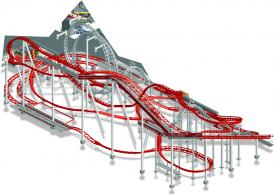
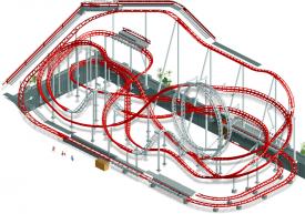
Has anyone ever thought about posting screens that show no landscaping or any use of land textures as concept screens? i thought this would be particularly helpful in here since most screens usually just show a layout or building.It'd would also let people see parts of the park without giving everything away.Something like this

-

 JDP
Offline
That looks fucking sweet. It's like a whole new game.
I wanna see that Sch at another angle as well.
-JDP -

 RRP
Offline
do what the screen?remove base land/walls in rct,save screen open in photoshop and use the magic wand to delete all black
 -

 Milo
Offline
thanks Gareth and Comet for the comments.
here is another image of a different park im working on themed around venice.
woah, good stuff...
 Tags
Tags
- No Tags


