(Archive) Advertising District / Dump-Place
-
 19-April 07
-

 SSSammy
Offline
i'll build whatever the fuck i want to build. im so sick of everyone calling it an LL rip off. its rct2 that was inspired by some LL. GET THE FUCK OVER IT PEOPLE, god damn.
people are probably gonna start yelling at me now,
let the yelling start:
Nokia, although you can act like a noob sometimes, i enjoy your work, especialy the rct2/LL. i find nothing wrong with that whatsoever. and im siding with you on the argument as your opponent has very little grounds... keep posting pleasing screens mahn.
now im done making a noob of myself, i shall continue making a noob of myself.
DelLagos, im not feeling that screen too much, i think it cause of the muddyness of the colours... its a bit ... erm... mleh, otherwise, it looks fantastic. -

 dr dirt
Offline
Dellagos, no matter what theme you do, your architecture all looks the same to me. I suggest you ditch the art-deco in this screen and throw in different details that go with this theme.
 -

 DelLagos
Offline
Thanks for your comments!
I think it would be pretty awesome if you change the colours of the supports.
But which colours would fit the theme? -

 JDP
Offline
Nokia, even though I am not a fan of you, don't let shit get to you. Build how you want, the way you want.
And I am all for completed screens, but since this is the dumb place it's fine. So keep you head up and keep doing what you do.
-JDP -

 DelLagos
Offline
Which colour sheme do you like best?
#1 - old one
#2 - old one with grey supports
#3 - new one, yellow track and grey supports
Hope for a few answers. -

 SSSammy
Offline
yaay more weak screens
from a gokart park. maybe if i spend enough time on it it might one day become a CC...
constructive critisisms welcome -

 Brent
Offline
That's pretty cool looking. Just kinda weird how you have three different types of scenery items for walls (concrete or whatever, wood and brick).
 -

 rct2_tom
Offline
@Dellagos: #1, it gives me more the "jungle" feeling.
@SSSammy: Sorry, don't like it. To grey for the size of the building. I should make a steep roof instead of what you have now, the flat roof. -

 JiMeMo
Offline
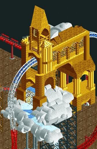
just a picture of a little something I'm working on.
colors, etc. are obviously not final and this is very unfinished.
 Tags
Tags
- No Tags


