(Archive) Advertising District / Dump-Place
-
 19-April 07
-
 z3r0-G
Offline
^Agreed. Looks like its coming along pretty nicely. I love what you're doing with the fences. Are you going to add any path?
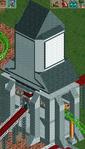
Here's an updated version of the screen I posted above..
I've changed the colors of the coaster and windows, and I fixed the land a little bit. I also deleted some of the wooden path, changed the flooring of that patio area of the house, and added a few rapids where needed. You can also see a small portion of the brake run housing and the track coming off of it, on the left side. Here's one more just for the hell of it..
Edited by z3r0-G, 23 June 2007 - 05:44 PM.
-

 Lloyd
Offline
It just doesn't flow at all. The purple/pink in the windows looks really bad, and it all seems sort of, messy.
 -

 Carl
Offline
eman, those screens you showed are awesome, I love that archy style and color scheme. Now all you need is some ride interaction with the next building you make in the complex.
Carl
Offline
eman, those screens you showed are awesome, I love that archy style and color scheme. Now all you need is some ride interaction with the next building you make in the complex.Edited by ride_exchanger, 24 June 2007 - 06:31 AM.
-

 z3r0-G
Offline
Window colors could always be changed, and I'm currently working on redoing everything on the left side of the screen, since I don't really like the way it came out. Any suggestions though?It just doesn't flow at all. The purple/pink in the windows looks really bad, and it all seems sort of, messy.
-

 CoasterAnne
Offline
^ Wow, thats waay to big.
These are my new dueling woodies (NOT for PT3) which have two completely different layouts but they come back into the station at exactely the same time


Edited by CoasterAnne, 24 June 2007 - 09:54 AM.
-

 deanosrs
Offline
Lucas, it's his park not yours, you can't demand changes! Just say a way in which you personally, would think it might look better.
As for your screen, it's likeable although the queue line needs more themeing in my opinion, compared to the rest of the station. Also the building footer over the top of the queue line looks a bit strange, there must be a way around that.
Coasteranne - I'm sorry, I still have a picture of a girl posting every time I read one of your posts. Not a bad thing of course, just not necessarily representative of you! The woodies look ok, but the themeing of just throwing trees everywhere is unoriginal, unrealistic and lazy. Don't put all out to get them arriving back at the same time either - the in race near collisions are far more important, and it would be nice having them go up the lift hill at the same time, which I don't think they are at the moment. -

 rct2_tom
Offline
The Lay-out looks very nice Coasteranne. The theming is to much 2- colors (green-gray-green-gray etc). It is also to brown. Your architectur looks intresting.
(Now in Netherlands: Waarom zet je dit niet neer in het testtopic? )
)
-

 CoasterAnne
Offline
I have this all my school time so I got used to itCoasteranne - I'm sorry, I still have a picture of a girl posting every time I read one of your posts. Not a bad thing of course, just not necessarily representative of you!

The woodies look ok, but the themeing of just throwing trees everywhere is unoriginal, unrealistic and lazy. Don't put all out to get them arriving back at the same time either - the in race near collisions are far more important, and it would be nice having them go up the lift hill at the same time, which I don't think they are at the moment.
They do go up the lift hill at the same time.
I think I'm going to place something under the coaster, but I just don't know yet what. -
![][ntamin22%s's Photo](https://www.nedesigns.com/uploads/profile/photo-thumb-221.png?_r=1520300638)
 ][ntamin22
Offline
ZOMG, very quick topic.
zero- i actually liked the previous purple. i forgot to mention it, but i kind of liked the way it was randomly purple. made it stand out nicely. the landscaping looks to be improved, but could still use some smoothing over. Both screens seem a little bare, but the colors work alright for me.
anne- intriguing, but i'm not seeing much more than wood and .. well, woods. The eighth-tile barrier around the station doesn't really fit with the station architecture. Which, by the way, isn't bad, though it could stand to be a bit more bold; what i mean is... i dunno. less symmetry, more splash colors.. make the building something to be looked at, not just the building that happens to be on top of the station.
eman- quaint is EXACTLY the word i was going to use- going to, that is. I've decided it no longer fits. The building looks like a little New England church, but the colors are all wrong.. i'm okay with that i guess, though. What kills the quaintness is that you built another one right next to it. Alone the first building looks spectacular, but next to another building with identical colors and an apparently random steeple, it loses all meaning. I'm not really sure what kind of theme you're going for, but a suggested fix would be to change the colors of one of the buildings ( the church is screaming for whitewashed clapboards ) and to remove the random steeple. then you've got a lovely little church next to a nice private residence or shop.
lucas- um. not sure what to make of it, but i'll trust you to do something to make it look better than it does. because it doesn't look so hot right now.Edited by ][ntamin22, 24 June 2007 - 11:46 PM.
-

 z3r0-G
Offline
Thanks for the input. I'll work on it a bit more.
@ Coasteranne: Doesn't look bad, but I'm not really a fan of the green/gray rooves. I'd choose one solid color and go with that. Also, theres wayy too much brown. I'd try to lighten the queue area up with some bright green shrubs and some different colored flowers mixed together. Thats how I usually do it, and it usually comes out looking pretty nice imo. -

 Louis!
Offline
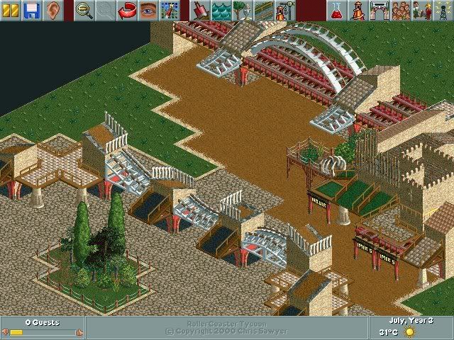
Unfinished screen from new solo Kronikals.Edited by Pineapple, 27 June 2007 - 11:18 AM.
-

 muuuh
Offline

@ Pineapple: I really like it, but I think there`re no special colors on it! I think the "darker" red could be betterEdited by muuuh, 27 June 2007 - 01:15 PM.
-

 Jazz
Offline
It shows skill but there are too many different textures and theming ideas that just appear to be thrown together; nothing really flows.
Not bad though. -

 Ling
Offline
@Pineapple: I like it, except for your retarded spelling of Chronicles.
@muuuh: it looks pretty good, but sort of random. Maybe make the colors flow better and it'll look better. -

 Louis!
Offline
^Thanks, plus I do know how to spell Chronicles. However the retarded spelling fits better with the overall theme.
posix - Thankyou.
muuh - The colours in this section are meant to be drab and less vibrant.
 Tags
Tags
- No Tags
