(Archive) Advertising District / Dump-Place
-
 19-April 07
-

 Steve
Offline
Yeah, IF it develops. No offense RRP, I love you man, but you started two other RCT2 parks and left us cold. I'm sick of designs!Its gonna be really interesting to follow this and see it develop!

Still looks good though, of course. -
 RCTmike
Offline
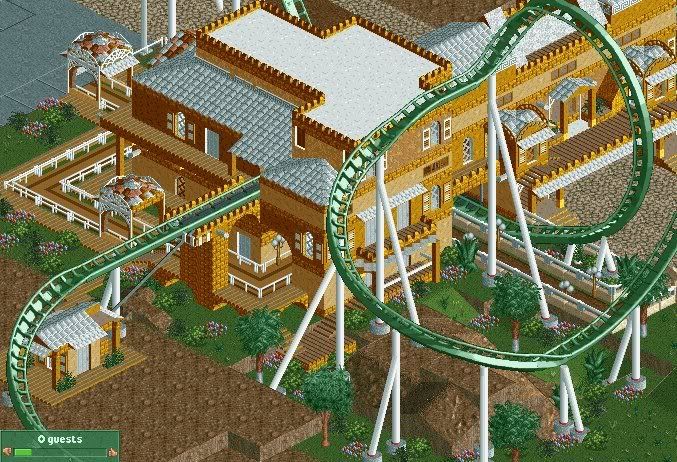
That blue path isnt there anymore btw. Not complete lookin for foilage opinions. Still workin on landscaping as well. -

 Katapultable
Offline
I don't see any blue path. What's up with the house underneath the rollercoaster?
Overall it looks good. -

 Louis!
Offline
^I think he meant the grey tarmac?
It looks really nice, but the roofs could do with a different colour. Other than that, some nice stuff. -

 Nokia
Offline
for the helix thing, the supports should face inward but since thats rock is there idk,
umm, i would like it more if the building had a black roof, other than that it is a very nice screen. -
![][ntamin22%s's Photo](https://www.nedesigns.com/uploads/profile/photo-thumb-221.png?_r=1520300638)
 ][ntamin22
Offline
looks very good. I'm not sure I would have gone with this color scheme, but eh. I like the open grass area and the building flythrough is neat. Those queue covers look a little out of place- they're much more ornate than the building next to them. In terms of foliage I'd say keep it fairly minimal- those cabbage trees with a few smaller ones, some shrubs, and then a lot of open grass with occasional flowers patches.
 -

 Werner
Offline
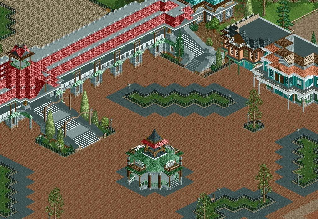
Almost the entire Mainstreet will be rebuild
 I didn't like is anymore. It had no glasswindows witch i wanted to do...
The Mainstreet Railroad Station, inspired by a concept-art from: Disneyland Paris, From sketch to reality
[/b]I still need to do some things with 8-cars, Zero Clearence![/b]Edited by Werner, 25 February 2009 - 02:08 PM.
-

 Comet
Offline
Is it a custom flat?
Anyway this looks really good but I don't really like that location for a carousel. The scramblers fine but I think a carousel should be central. -

 Six Frags
Offline
wow werner, that's pretty damn awesome man! Please finish that park..
Or start a topic in the Ad. district with more screens
SF -

 Corkscrew
Offline
Huss Jump? Starflyer?
I honestly have no idea.
Looks interesting though. Looks like you're going for an oversized fun fair, something alike Oktoberfest, regarding the large amount of travelling coaster models you are planning to build.
Keep it up! -

 Lloyd
Offline
I have that book, it's brilliant....inspired by concept-art from: Disneyland Paris, From sketch to reality

-
![][ntamin22%s's Photo](https://www.nedesigns.com/uploads/profile/photo-thumb-221.png?_r=1520300638)
 ][ntamin22
Offline

Project star.
finished and submitted.Edited by ][ntamin22, 27 February 2009 - 08:27 PM.
-

 robbie92
Offline
I have a strange feeling I've seen the second screen before, but I'm absolutely loving your use of diagonals. It's got great form.
 -

 zodiac
Offline
i know i've seen them before, and they're just as lovely as they were before. glad to see you finish something.
 Tags
Tags
- No Tags
