(Archive) Advertising District / Dump-Place
-
 19-April 07
-

 robbie92
Offline
^Haha! Bingo...
EDIT: About what my park is, not nokia.Edited by robbie92, 21 February 2009 - 02:28 AM.
-

 SSSammy
Offline

Reassured Cocoa?
comments&critisism apreiciated as always.Edited by SSSammy, 21 February 2009 - 12:08 PM.
-

 turbin3
Offline
Man, you should stop posting screen after screen...
Nothing special btw...
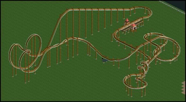
A small woody
-

 robbie92
Offline
It's okay...
I don't know, it's a little small. Lately, a lot of your comments seem to criticizing the size of people's archy, that it's too small, but this is the same size... Other than that, it looks fairly nice. -

 turbin3
Offline
With criticizing the size of buildings i mean not only one building, but buildings in the same size near to each other.
-

 Katapultable
Offline

Reassured Cocoa?
comments&critisism apreiciated as always.
I like it, but it reminds me too much of 5dave's Pro Tour entry. You know, that GCI woody. -

 Louis!
Offline
RRP i'd say the blue, whilst it's not as realistic as the red, it flows a whole lot better but still manages to portray what it's meant to.
 -

 J K
Offline
Love it, so much character and things to look at. I can imagine actually riding it. I love things like this.
 -

TwistedHelix Offline
Tolsimir that looks very nice but I cant stop thinking about how dangerous the turn looks without any fences around it or anything like that.
Hey guys I'm having trouble creating a realistic design for a B&M invert. Heres the best I've coem up with and I'm quite fond with it. Just wondering if you guys can see anythign I could improve with it.
Cheers
TwistedHelix -

 Micool
Offline
Tolsimir that looks very nice but I cant stop thinking about how dangerous the turn looks without any fences around it or anything like that.
it's a GAME! -

 Liampie
Offline
You never see a straight drop on a B&M invert..
But it's not impossible, and therefore it's realistic.Edited by Liampie, 22 February 2009 - 01:19 PM.
 Tags
Tags
- No Tags


