(Archive) Advertising District / Dump-Place
-
 19-April 07
-

 RRP
Offline
Will change that gee,Cheers JK and kumba.
Its a semi recreation based on http://www.coastersa...ostar_eng.shtml which model is also based on -
Xcoaster Offline
I makes me think of a stave church, but done with a medieval or gothic style (ie, lots of stone instead of wood). -

 turbin3
Offline
dont like the small trees, the ladders and the too big flag on the roof
Great architecture! -

TwistedHelix Offline
RCTNW: Yep the view of it is meant to be blocked near enough completely. I'm glad you like it your work is a real inspiration for me as I love your realistic clean cut style.
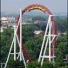
Anyway heres a new screen showing the Giovanola mini hyper (I suppose thats what it'd be called only being 150ft high) Wipe Out. Its on the boardwalk area off the park that even in its unfinihsed state I'm quite happy with.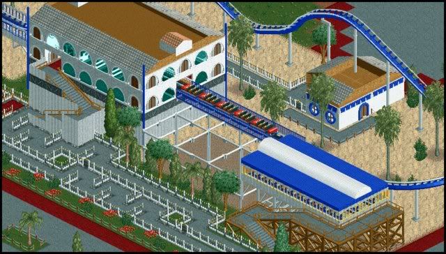
Cheers
TwistedHelixEdited by TwistedHelix, 20 February 2009 - 06:38 AM.
-

TwistedHelix Offline
ZeRoSkIlL: Yup you'd be right no cs and no trainers just to see what I can come up with.
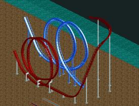
That looks nice but most of the supports arn't touching the track and I think you should fix. The track above the path in the bottom left looks a little strange as well. -

 ZeRoSkIlL
Offline
Wow, good look Helix, I didn't even notice some don't touch the track... o.o
As for the one integrated into the path, I'm not sure what I can do to fix it - it's just a visual glitch because it's zeroed in.
I'm diggin yours if you're going to for no hacks or custom scenery. However, the building on the top right looks a little plain. Maybe some layering on the blank walls and de-block the roof? I like the sunken idea but it doesn't look right. I'm also not a fan of the railings in the queuing line, but meh, just me. -

 robbie92
Offline
Coming soon to an ad district near you...
Oh yeah... This is from the same park as the Independence Hall, and no, this isn't Six Flags. -

 robbie92
Offline
Although the red one is glitchy, it seems more accurate to the original. I like it more.
@RRP: The white wooden wall is gonna be covered up by another building.
@Posix: Thanks!
@Xcoaster: Close, but no cigar... Think mice... -

 rct2123
Offline
I like the blue one for the exact opposite reason. It may not be exactly accurate but it's not glitchy...
-Rct2123 -

 Nokia
Offline
not really fealing it.
that white building with the brown things on the side is fucking ugly.
just start over please, -

 Steve
Offline
You are the most useless person on these boards. Stop telling people what they build is "ugly" and that they should "start over."not really fealing it.
that white building with the brown things on the side is fucking ugly.
just start over please,
I'm not saying you need to be nicer or whatever (but it would help), just be more constructive and less of an asshole. You're in no position to be telling others what to do.
Robbie: Looking good, it reminds me of Liberty Square at Magic Kingdom.
 Tags
Tags
- No Tags
