(Archive) Advertising District / Dump-Place
-
 19-April 07
-

 RRP
Offline
its progressing nicely,
yes there will be a schwarzkopf aswellRRP: Very cool. Are you going to build more of those models?
-

 Louis!
Offline
TH - reminds me of my woodie in Discovery Island <3 really nice stuff. although I think the path could be closer to the coaster & maybe use crazy pathing?
 -

 SSSammy
Offline

unfinished evidently
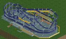
i like this layout. it maintains a good steady pace all the way through
feedback apreiciated -

 Ride6
Offline
SSSammy, I like the layout EXCEPT the drop into the breaks... If you have a drop that large there the train clearly has enough speed to haul it around a helix wrapping around the lift... Or something.
The Hulk screen up there is impressive, but I don't particularly like it for reasons I can't quite explain. Great ratings though.
Twisted Helix, that looks like a very nice layout. I actually really like that you've given it a good deal of breathing room as many coasters in rct (lately in particular) are buried in buildings, landscapes and theming. What's there is very refreshing.
RRP, Eurostar is the shit. I don't know much about it (as far as layout, etc) but I love that you're doing something "different" for invert supports to make it come out feeling right, and the fact that it's a sweet-ass ride doesn't hurt either. I'm really looking forward to seeing how that one comes out.
Ride6 -

 Nokia
Offline
I've given nokiaa access to LL countless times but he can't install it cos he's too stupid.
that happend one time damnit. -

 Cocoa
Offline
sssammy, that layout looks amazing. However, it better look that good from every angle or I'll be mad. Because if it didn't that would just ruin what a good job you've done on it.
P.S. Red handrails look bad- one of the things I learned on comments about the Curse (which really helped me with my style you guys- thanks) -

 nin
Offline
@ eyeamthu1: that pic gives me major inspiration, it's great. Yet like others have said, change the path, get some texture into it. The Hulk sign isn't too great imo either..
 -

TwistedHelix Offline
Loius: Thanks and that isn't a path as such but a road outside the park leading to the maintanance and storage sheds for the coaster (I'll get another screenshot soon to show you what I mean) hence why the trees around the fence are so high. I haven't seen you woody (I dont think) but I'm glad you liked this anyways.
Ride6: Thanks, that was my approach with the wide open spaces as I wanted it to be as realistic as possible and while it is themed I didn't want it being swamped as I prefer the simplistic style myself.
Cheers
TwistedHelix -

TwistedHelix Offline
Nothing new I just reworked the previous screen so that the fencing is actually on the outside of the park and actually acts as a boundary which is what it was meant to do in the first place (I also had to start agian in a new map becasue I forgot some of the essentials scenery pieces I needed) and I reckon the newer screen looks niceer anyways
Btw all finished but the bottom left corner outside the park.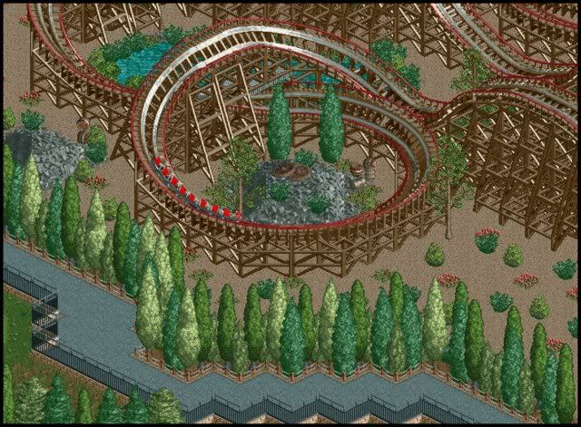
Cheers
TwistedHelix -

 RCTNW
Offline
^So is the path for Peeps or for staff as part of a back stage area? If it's for the peeps, then you are effectivly blocking the view of the coaster with all the tall tree's lining the path.
Glad to hear it's progressing though
James
Edit - I just read the post about his being part of the backstage area. In that case, disregard my comment.
Thanks
James -

 J K
Offline
I have to say that is such a nice looking screen, the layout is small and dynamic, the added extra's are well thought out and they compliment the coaster. Sure Brilliance! I'm glad your from the UK.
 Tags
Tags
- No Tags


