(Archive) Advertising District / Dump-Place
-
 19-April 07
-

 spartan
Offline
The nets(?) are nice but unnecessary. They are usually only used when the track is somewhere were something dropped could potentially hit someone.
 -

 J K
Offline
I really like the look of those nets. Really nice stuff there. As others have said you need to improve the supports.
You could do this by connecting them a bit better (try different positions of the pole to see which placing of each piece fits in best).
After that your landscaping is good and it shows some level of skill. I don't know what theme your going for but I usually think its best to have 80% smooth land and the rest some jagged pieces to give you something different to look at. Just seems a bit forced at the minute.
After that your foliage is a bit scattered. Try choosing three types of trees that compliment eachother then surround them with two types of bushes that compliment the trees. Instead of one random bush anywhere you have a collection of foliage that will blend into the scenery.
Try those points and your'll have a really nice screen. Obviously its your work so attend to what you want to do. -

 SSSammy
Offline
thanks J K
That is Genuinly helpfull
i know im terrible at supports and foliage Yannik
and spartan, i saw a picture of one B&M and it was in a lake wich had nets... maybe its for if it falls in.... never mind. kryptic logic.
ill sort it out and will return
thanks alot. -

 RCTNW
Offline
The 1/4 tile supports only work on curves, diagonals or when you are doing inverts. For straight pieces, either use the fule tile or 1/2 tile supports depending on what you need how the supports. As it stands right now, you are using 1/4 tle supports that are off center.
Hope it helps
James -

 geewhzz
Offline
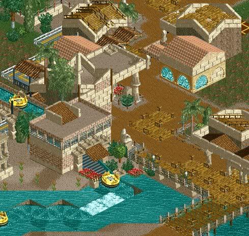
that's very likeable, however, i feel your water channel is much to wide to be realistic.
 -

 SSSammy
Offline
De tower at the drop is too narrow.
i know it would rip your face off.
the supports look kinda wierd though, like they cant support it.....
but thast coming from me so,.. yeah.
looks pretty damn awesome.
i didn know you could get those kinda elements in a dive machine in real life.
obviously its done by hacking here. -

 nin
Offline
that's very likeable, however, i feel your water channel is much to wide to be realistic.
YEah, the rafts would get stuck on the shore.
Other than that, it's nice. -

 eyeamthu1
Offline
Nokia - I like it; good stuff.
Camcorder - hard to comment on it as it's pretty unfinished, but I REALLY like the catwalks on the lift-hill, and that helix does looks awesome, somehow. Presumably you're changing the train type to a regular dive machine vehicle? -

 turbin3
Offline
Nokia:
Really like it, good work for no CS.
Camcorder:
You call it shit?
Looks like a great layout! -

 SSSammy
Offline

wee Logo For Tesseract. i cant do an A though...
nothing special, i was just proud of it
-

 MF72
Offline
Nokia: I actually kinda like it.
Cam: Absolutely beautiful. That helix is amazing.
SSSammy: I'm not sure that's exactly worth posting. -

 Camcorder22
Offline
Thanks for the comments, do you really think I should change to vertical coaster train though? Because that train type doesn't support the elements I have and if I shorten the train at all, it goes through the layout a little too slow.
 Tags
Tags
- No Tags


