(Archive) Advertising District / Dump-Place
-
 19-April 07
-

 gir
Offline
I've been on Borg and Superman, and I gotta be honest nobody wants to be on their back that long. It's boring and somewhat uncomfortable, especially if you're staring/baking in the sun.
 -

 Milo
Offline

It's been a while. I'm pretty rusty at both games.
I don't know what I'm doing with this.
good screen -

 robbie92
Offline
It looks good, but I'm starting to get tired of your LL-look-a-like RCT2. You had some good stuff going on, and I just don't feel that this type of work is up to par with some of your other stuff I've seen. Don't get me wrong, it looks nice. However, its not a style I'd prefer from you.
 -

 J K
Offline
Nokia - Nice use of land variation, the setting seems nice. I do think the new brick dosen't look right next to the old wood. Also the floating rooves don't look sturdy so maybe something to pad them out a bit?
InVersed - Awesome screen, I like that there is no distinctive colour. Your LL work always looks good. -

 SSSammy
Online
this is me owning up to my screwups in both RCT and intelligence. apologies to annoyone who was correct, you may point and laugh.
perhaps this is better.
EDIT: Bacchus, i adore it.Edited by SSSammy, 11 February 2009 - 12:40 PM.
-

 Bacchus
Offline
It looks better now Sammy, but i'm not sure about the first element, and please fix the unbanked turn after it.
Thanks for the replies guys, I can tell you making parks of this size is alot of fun .
.
Here's something I made today: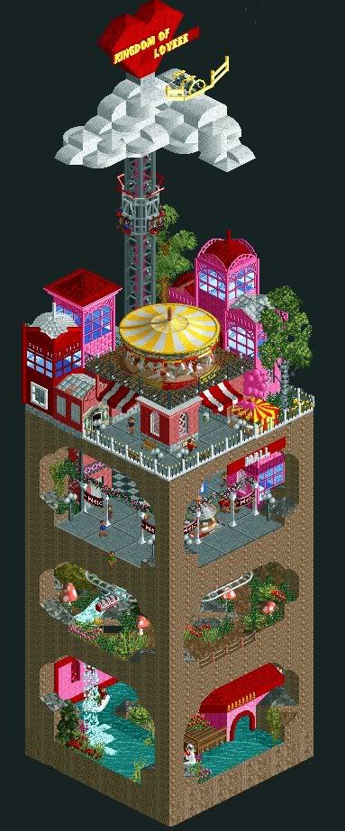
It's for avenged's picocontest btw. -
 MF72
Offline
I love it, but what exactly is that thing on the clouds with the wings?
By the way, I love how the water from the second level seeps down to the first level in a waterfall. Clever. -

 J K
Offline
Nice idea used perfectly in a small space. It could always be a full area in a solo but I don't think it would have the effect this map does. Nice work.
 -

 SSSammy
Online
thanks Bacchus, i will do, your screen kept me transfixed for around 6 mins. somethng that little can hold your attention much longer than a spotlight... well my attention anyway.
 -
 Evil WME
Offline
That is really cute. I'm impressed.
I'm guessing the peeps go off the 'map' to get onto the rides? -
Xcoaster Offline
That's very nice. There's almost a sickening amount of cutesy loviedovieness. And a good use of space. -

 zburns999
Offline
Much better Sammy.
Bacchus, that's pretty sick. How do peeps get from level to level? -

 tracidEdge
Offline
got damnIt looks better now Sammy, but i'm not sure about the first element, and please fix the unbanked turn after it.
Thanks for the replies guys, I can tell you making parks of this size is alot of fun .
.
Here's something I made today:
It's for avenged's picocontest btw.
 Tags
Tags
- No Tags
