(Archive) Advertising District / Dump-Place
-
 19-April 07
-

 Katapultable
Offline
That somehow reminds me of ''National Treasure''.
I like that B&M floorless coaster. -

 Cocoa
Offline
That looks great. Really.
I especially like how you used the windows as shutters for the large window! -

 Xophe
Offline
Robbie that building is stunning!
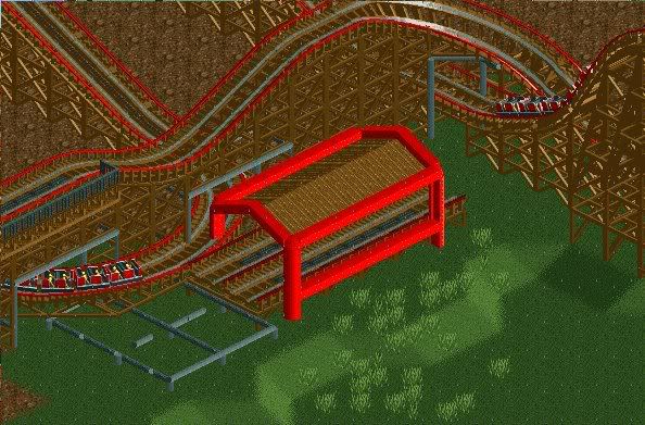
Nokia, I don't really see how that transfer would work. Usually there's a sliding bit of track long enough for the whole train to sit on that connects to the storage track. -

 CedarPoint6
Offline
Whoa, nice Independence Hall, Robbie. I love it.
You're architecture is improving at a ridiculously fast rate. The composition of the forms in that building is fantastic-- perfect detailing so that it's easy to tell what you're doing, but not too over detailed so as to detract from the building itself. Hope you'll keep up with this-- very excited to see that finished. -

 robbie92
Offline
@Cocoa: The side windows are actually supposed to be windows. It's a palladian window. The center's supposed to be an arch, but that's the best I could do in RCT2.
@CP6: Thank you!Edited by robbie92, 08 February 2009 - 12:43 PM.
-

 BreakAway
Offline
I know it's bad to post back-to-back screens, but fuck it! Here's another screen.

Keep your eyes peeled...
Just to bring it to the second page.
Amazing stuff, robbie. I stared at it for about 3 minutes.
@Nokia: Xophe pretty much says it. It'd be hard to get those trains over to the transfer tracks. And the far left pillar in the screen doesnt touch the ground...it kinda bothers me. But it's not horrible nonetheless.Edited by BreakAway, 08 February 2009 - 01:14 PM.
-

 SSSammy
Offline
That somehow reminds me of ''National Treasure''.
no somehow in there Mozilla.
was that your inspiration Robbie?Edited by SSSammy, 08 February 2009 - 02:14 PM.
-

 robbie92
Offline
Sort of...
I was inspired by Independence Hall in Philly, which is in National Treasure. It's an icon of colonial America, so I think it fits perfectly in the area. Oh yeah, it's not an exact replica. -

 K0NG
Offline
I'm loving that Robbie. Like BreakAway said, I actually stared at that for a few
minutes. I might suggest though.....continuing the thin art deco piece around the
end of the building, possibly making the blocks and pole pieces at the top white/
gray to break up the red and fixing where the corner pieces cover part of the
windows.
Other than that, it's gorgeous. -

inVersed Offline

It's been a while. I'm pretty rusty at both games.
I don't know what I'm doing with this.
 Tags
Tags
- No Tags


![][ntamin22%s's Photo](https://www.nedesigns.com/uploads/profile/photo-thumb-221.png?_r=1520300638)