(Archive) Advertising District / Dump-Place
-
 19-April 07
-

 Nokia
Offline
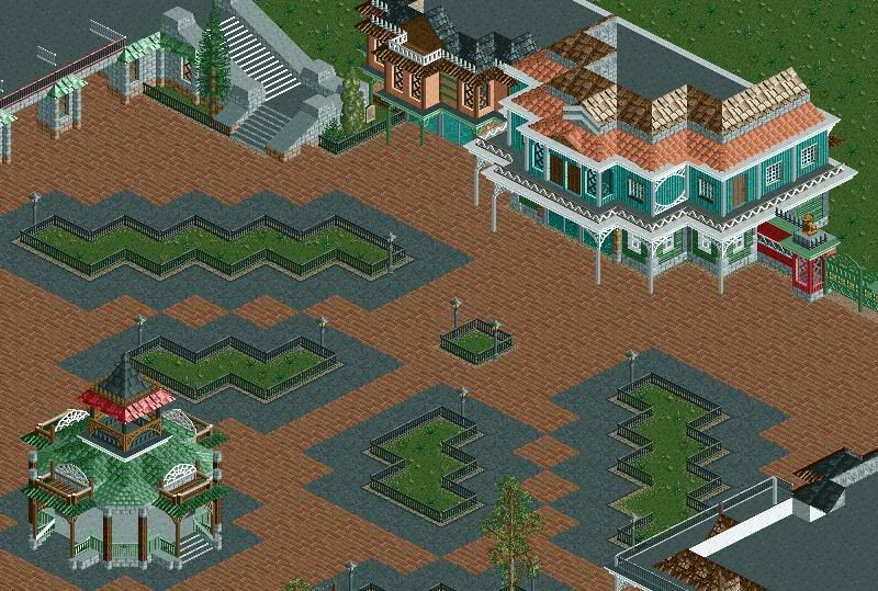
i still think the windows on the pink building dont look right.
but everything looks great!
i think putting some benches where the fence thing is or some lights even, or custom lights.
just throwing ideas out there. -

 robbie92
Offline

Medusa Layout and Stats
Comments are welcome.
EDIT: I betcha can't tell where I got my inspiration from...
Edited by robbie92, 07 February 2009 - 03:04 AM.
-

 nin
Offline
I'm not sure on that layout, robbie. I know where you got the "pre-spiral" before the initial drop, but is it really necessary? It was necessary on superman, as it drops onto the cliff, but here its just free-standing; there's no point to it.
and thanks everybody. -

 Daisy
Offline
wow, really good. but try adding foliage
I'll assume that some trees and stuff are destined for the little fenced off areas.
You've combined some really interesting pieces in that gazebo thingy and it looks great.
For some reason I absolutely love the staircase, very pleasing to the eye. Can't wait to see more from you.
Edited by Daisy, 07 February 2009 - 10:40 AM.
-

 posix
Offline
wow, werner, that's nice. reminds me of iceman (now highball).
nin, i'll have to agree with blink. somehow it's not working. -

 robbie92
Offline
@nin: I liked the idea of a pre-drop turnaround, and it looked nice, so I wanted to incoporate it.
The layout shows one aspect of the park that I want to somewhat showcase, and that is using diagonals. Expect most layouts to incorporate diagonals, and speaking of...
-

 turbin3
Offline
@Werner: Fantastic joob, go on with that!
@Sammy: Don't like it...sorry, cant say why.
@robbie: Really nice, but get rid of the water plants.
-

 robbie92
Offline
I know it's bad to post back-to-back screens, but fuck it! Here's another screen.
Keep your eyes peeled...
 Tags
Tags
- No Tags


![][ntamin22%s's Photo](https://www.nedesigns.com/uploads/profile/photo-thumb-221.png?_r=1520300638)

