(Archive) Advertising District / Dump-Place
-
 19-April 07
-

 MF72
Offline
That looks awesome Micool. The only thing I don't like is the pink bobsled track. Doesn't seem to work or fit in.
 -

 posix
Offline
micool playing again. awesome
i like the path rooves a lot. they work very well there. -

 Six Frags
Offline
wow micool
Never thought I would see you play again..
It's nice to see those great players from back in the day visit NE again..
Screen looks classic. Please continue to play!
SF
edit: @ yannik; Looks nice, but maybe get some more variation in your pathing, by adding other path types or some trees here and there.. -

 SSSammy
Offline


evidently unfinnishederered
feedbak plz
: D
taa
EDIT: 3 new pages.... SCORE!Edited by SSSammy, 06 February 2009 - 04:02 PM.
-

 geewhzz
Offline
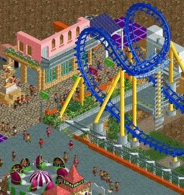
lovely, so much atmosphere, now if only it were finished. some low zone fences by the base of the track would be good as it seems people could easily get in that area..also make the ladder rungs not 'floating'
 -

 robbie92
Offline
Lovely... Is this what I think it should be?
Anyways, I'm loving the boomerang colors, as well as the building. Also, I agree with everything Gee said. Oh, and next time, I'd love to see a finished shot.
 Tags
Tags
- No Tags
