(Archive) Advertising District / Dump-Place
-
 19-April 07
-
 CedarPoint6
Offline
Comet. Looks good so far. Can't wait to see the rest. I like the small park feel without much of a grand entrance. Some people tend to overdo that stuff.
Splitvision. Interesting things. Good to see a suspended coaster, although the supports should be on the inside of the corner (unless you're looking at Big Bad Wolf, which is a different story for totally different reasons). Either way, put them on the inside of the corner. Suspended also don't have diagonal bracing. Not a bad start to the layout, though! Also, I've never been a fan of the white-yellow combination, but that's just a personal thing. -

FullMetal Offline
Wow, that looks really good, SV. I'm loving the interaction between the dive machine and the waterfall. CP6 already pointed out the supports on the suspended coaster, but other than that, it all looks very good.
You too, Comet. Nice choice of colors for the trees, but I'd go for brown instead of red. Nice Stadium as well.
And now, for the first of the last two screens for Le Tonnerre. It's nearing completion, so I'll be sending it in within the next week or so.
I figured that since I've shown so much archy, I'd show some of the coaster and foliage. Enjoy! -

 robbie92
Offline
^I'm liking the vibe of that shot. It seems very quaint and picturesque. I like it.
Yes, it's unfinished. -
 Splitvision
Offline
CP6 - yeah, I can see why the supports should be on the inside, and I'll try to build them that way as much as possible, though at some places that just doesn't work. I'm not sure of the meaning of the word "bracing", do you mean supports?
FullMetal - Thanks Liking your screen aswell, the pink flowers are a nice touch, and the train colours are perfect.
Rob - not much, but what's there looks good. I would like the supports to be reinforced with some slanted beams, in the direction of the force that the train puts on the track... Hard to explain but I hope you get what I mean
Edited by Splitvision, 01 February 2009 - 03:52 AM.
-

 Milo
Offline
Xin, gardens in the general landscape are a good idea but mix up the colors a bit on them.... would make it look more natural
 -

 SSSammy
Offline
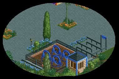
if your trying to do a round station type thing for the water ride you failed.
but if not then it looks stupid there. so anyways get rid of it.
i think the coaster would like better if it was supported,
that random brown rock thing looks werid there,
the coaster layout itself is decent, and thing you should work a little more with your land types and maybe use 8-cars more often
man i sound like a bitchhhh
it isnt finnished so it would look shit.
theres a station building anyway.
oh nevermind cba explaining. -

 Louis!
Offline
Splitvision CP6 means that they don't use the slanted support (diagonal bracing). They just use vertical supporting see link below:
http://rcdb.com/ig129.htm?picture=3 -

 SSSammy
Offline

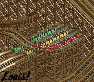
nearly done on this bit, but there is a portion of the ride i want to be invisible, but abit is diagonal. Kumba said there was a function on the latest 8 cars that does it, but im unsure wich is the newest...
skill and precision witht the crop tool. -

 Splitvision
Offline
Splitvision CP6 means that they don't use the slanted support (diagonal bracing). They just use vertical supporting see link below:
http://rcdb.com/ig129.htm?picture=3
Ok thanks for the help, diagonal bracing is exactly what I meant for robbie's screen. I think I will keep them though, as I'm not going for realism with this park. -

 SSSammy
Offline
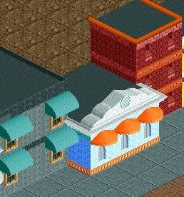
^ those are nice but they look, sort of plain if you get what i mean.
they look pretend...
i think if you have buildigns like this you need to have really anal details like lights and windowsils and things.
are you new to rct?
or just to NE? -

 nin
Offline
SSS, that's actually very interesting.
Robbie, it looks nice, and I understand what you're going for, but there's just something missing imo.
Rct-freaky, interesting color combination, but that's all I can really say. I can see that you went after a detailed structure(s), as seen in the small blue building, yet you fell short. Just keep building, get more interesting building shapes, all of them are very square. -

 dr dirt
Offline
SSSammy - you can make some pretty badass stuff, i like it.
RctFreaky - nice structures.
Nokia - i like the foliage, but thats about it. -

 SSSammy
Offline
dr dirt, i thanka you.
thankyou too, nin.
i maded-ed a changes to the Corkscrew RC. now named HydroForce.
i like it more now
the layout to the ride im rtying to invisiblify. its the b&m track on the water section im trying to get rid of. any help will be very much apreiciated on that.
its simple and, personaly, im very attached tto this ride. its themed to a government experement on a new depth charge. and in the watersection peeps can use switches to soak people on the ride - thats what the peir bit is for nokia. ive not done the details, on either ride, or the supports. very onfinnished basicaly
comments much apreiciated.
EDIT: BOW DOWN TO MY SUPIRIOR CROPPING SKILLSEdited by SSSammy, 01 February 2009 - 02:42 PM.
 Tags
Tags
- No Tags

