(Archive) Advertising District / Dump-Place
-
 19-April 07
-

 Turtle
Online
That's really good Inversed, but be careful about making your architecture overly detailed for the sake of it. The building at the top has this wierd brown brick bit, really hurts it I think. RMM is right about that picnic area, it needs something more. Don't listen to anyone about the colours, they're fantastic. Please keep going.
 -
 z3r0-G
Offline
Not really anything important, just practicing and messing around with different colors and theming.
Edited by z3r0-G, 22 June 2007 - 05:08 PM.
-

inVersed Offline
I am probably not one talk about this considering my screens, but I really dislike all the textures you used on the structure. It seems like you added them all to make it look more detailed but really it just does not flow at all. The foliage is not bad but would look a lot better with some 1x1 trees -

Wicksteed Offline
those flowers, bushes and landblocks seem very randomly placed.
The rest is ok, can't really say anything about it because it's such a small screen. -

 Carl
Offline
z3r0-G, inversed is right about the foliage in that screen, you should put your full tile trees in first, then and your 1/4 foliage.
I dont think you used too many textures, but I wouldnt use those asian roofs unless this is supposed to be an asian theme, which it doesnt look like to me. -
![][ntamin22%s's Photo](https://www.nedesigns.com/uploads/profile/photo-thumb-221.png?_r=1520300638)
 ][ntamin22
Offline
After examining the Watkins Woods arcade screen a little closer i noticed what appeared to be a DDR machine in the corner. However, i was rather embittered by it only having four panels. I decided to try making a realistic DDR machine for myself, and here's the result. Little bigger than real-life scale, but it should be the perfect size for peeps. ( i'd have a few in the picture and on the invisible path under the machine if the park entrance weren't bugged)
I think it looks pretty good, aside from the glitching on the 1/8th pieces. anyone have a fix for that? oh, and the bars are the best i could do - couldn't find any objects that fit better.Edited by ][ntamin22, 21 June 2007 - 01:01 AM.
-

 geewhzz
Offline
Looks good, it's setting is a bit weird though. I've never liked the way you do paths.
 -

 CedarPoint6
Offline
I like that one, Intamin. Nice job with that. Definitely a lot better then I managed.
 -
![][ntamin22%s's Photo](https://www.nedesigns.com/uploads/profile/photo-thumb-221.png?_r=1520300638)
 ][ntamin22
Offline
Billy- actually doesn't look bad from what i can see, but what i can see is indeed a very small amount. rather low-quality screens, as well.
 -

 lucas92
Offline
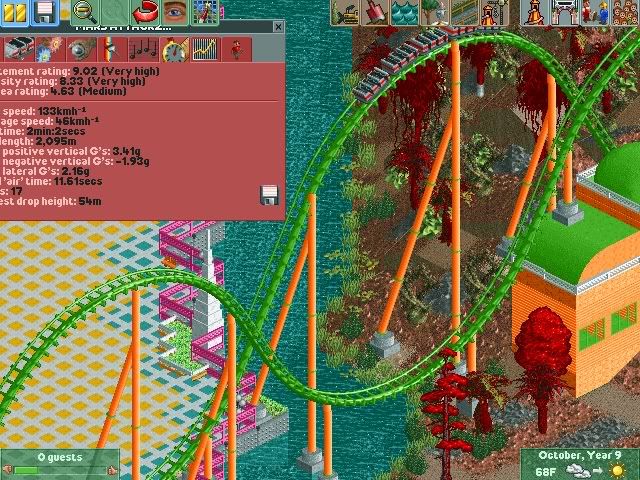
That's a nice coaster layout OLE! I think this is in LL, right?
What's this for? Solo, entry for design?
Edited by lucas92, 22 June 2007 - 10:33 AM.
-

 JDP
Offline
Nice to see someone making a Morgan/Arrow hyper around here. One thing though, if you would want to go for realism, you wouldnt use those supports on that ride. You would use something that looks like this coaster. Or if you going for something like Steel Eel, then I recomend thinker supports.That's a nice coaster layout OLE! I think this is in LL, right?
What's this for? Solo, entry for design?


-JDP -

 lucas92
Offline
Thank for the comment JDP, but I think the B&M support objects are the one who look the most similar to them, although I'll maybe add some more supports, because some said that it looks a bit unsupported right now...
This park isn't realistic too, so I don't mind the unrealistic supports unless they look real bullshit.
 Tags
Tags
- No Tags


