(Archive) Advertising District / Dump-Place
-
 19-April 07
-

 SSSammy
Offline
Was i the only one that thought that said ASDA?Hey, what is that?
i thought asda had gone too far this time -

 Splitvision
Offline
Ripsaw - I think it looks nice, apart from the dirt pile? on the right side.
Lloyd - Finally! Pokemon is the shit. The house maybe needs some more colour, unless you're going for the actual in-game look. Also, can't you make that pokeball more circular? Oh and as FK+Coastermind said, the grass = genious

-

 FK+Coastermind
Offline
to be blunt, the red and brown building just dont work. they look like you tried to make an asian theme and everything ended up too blocky. the red building just looks like any old building with asian rooves. the brown one looks better but those awnings are WAY to big. the simple building in the back is okay, more asian feeling, but not exciting or different. id stick with that building, and then look to spice it up with stronger, lighter, detail.
Fk -

 Todd Lee
Offline
Touchpads are evil if your used to a mouse
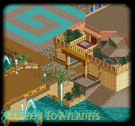
Heres another screen from my Journey To Atlantis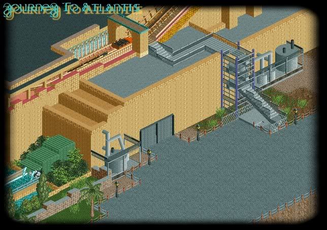
I'm lovin' the behind the scenes detail here!
Splitvision, you've got the perfect splash of color in those screens, really brings those screens to life.Edited by Todd Lee, 09 January 2009 - 07:32 AM.
-

 SSSammy
Offline


i do apoligise for the severe unfinishedness.
i decided i would apreiciate some early feedback.
all feedback is apreiciated. -

 Nokia
Offline
i like the layout of the blue coaster, but you dont have to have supports every other square, you can leave like 3-4 gaps inbetween
 -

 robbie92
Offline
I know it seems too soon to post another pic, but I just wanted to post a pic celebrating my first NE submission. Yes, I actually finished something. Enjoy this screen, and hopefully you'll see the project on the front page soon!

-

 Katapultable
Offline
SSSammy,
the roll into de dive-loop should go the other way around. It isn't realistic this way.
 Tags
Tags
- No Tags

