(Archive) Advertising District / Dump-Place
-
 19-April 07
-

inVersed Offline
Here's an updated screen of the one I showed previously in this topic. Maybe it will give you all a better idea of why i used the 2x2 building...
Here's a screen from an older park I built in RCT2, and was never completed. I personally love the atmosphere in this screen (though I know most would say otherwise) and figured why not show it
-

 Turtle
Offline
That entrance is lovely, really nice colours and atmosphere, only I dislike the tree on the far right, I think you should lose the far left tree and then change the far right one to the same type as the far left. Aside from that, lovely texture mix, please keep going with it. The quarter tile rock landscaping looks slightly choppy as well.
 -

RMM Offline
inversed that screen is almost perfect.
dont change a thing except for that tree turtle mentioned.
great colors too. -

 Lloyd
Offline
Yeah, just change the tree, and maybe smooth the quarter tile landscaping a little. But seriously, that's gorgeous. The purple flowers look great.
 -

 FK+Coastermind
Offline
Egg_head-those bathrooms look really awesome although i dont think the sinks would be visable from outside the bathroom. i guess its nice to see the detail but like in Kakuna sometimes you mihgt want people to have to look for the best parts. just a thought
Inversed-you have some very nice detail and atmosphere in those pictures. i dont think that 2x2 are necesarrily bad, but spice them up with some more interesting structures, maybe using Deco blocks. nice work
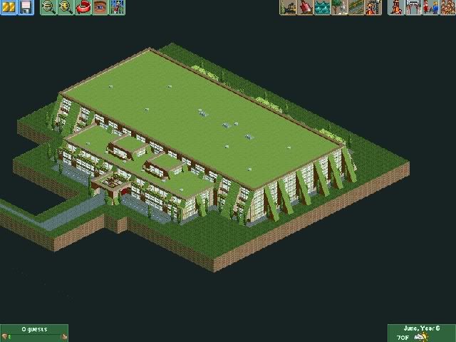
Woofenskid-nice looking structure. hard to comment on from this distance but it looks very green.
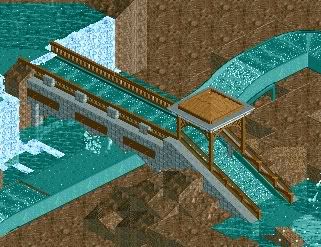
Here are some pics of the Water ride i spoke of. i never got to finishing it. i might at some point complete it but right now im pre-occupied with a design and upcoming PT3


FK -

 Turtle
Offline
It looks very clean in the details, which is very good to see. Can't really comment on anything else at the moment though.
 -

 Metropole
Offline
Lloyd: Hm, it seems a bit disjointed. The individual aspects of the screen are good, but they don't flow together very well in my opinion.
 -

 Midnight Aurora
Offline
Honestly, FK, I think that looks great as is. Just expand on that same look, and keep the foliage to a minimum.
 -

inVersed Offline
From the same park i showed a few days ago in this topic...
theres still alotta work to do here -

 FK+Coastermind
Offline
good detail although alittle random in places. im not sure if the brown path is on purpose but if so i would say take out the dirt paths parts. the color is abit random too. you have all this greena and brown and then thrown in a little bits of bright pink. also i dont like how the flowers are the same pink color. for realism sake i dont think a park would buy flowers that match the color of the coaster UNLESS it is meant to make up a sign for the coaster in some floral arrangment. nice screen overall
FK -

RMM Offline
beautiful screen inVersed. really.
try adding some flowers n bushes around the picnic area.
to give it a little more depth that it needs there. -
![][ntamin22%s's Photo](https://www.nedesigns.com/uploads/profile/photo-thumb-221.png?_r=1520300638)
 ][ntamin22
Offline
fantastic architectural work, but bad colors. everything is drab and kind of ugly. somehow it just doesn't work as well in this screen...
maybe a path change is in order.
a more solid-colored path would help to make it less fuzzy and unfocused. -

 w33maniac
Offline
To FK+Coastermind, please finish that water ride, the start was great. Really want to see it finished.
 Tags
Tags
- No Tags
