(Archive) Advertising District / Dump-Place
-
 19-April 07
-
 Goliath123
Offline
Maybe get rid of the footers cos they aren't touching anything, but the train in the overbank looks like un.
 -

 Dark_Horse
Offline
EDIT: Never mind.
It looks good Robbie, but the footers kill that. I would suggest changing them to a brown or black.
Dark_HorseEdited by Dark_Horse, 28 December 2008 - 07:48 AM.
-
Xcoaster Offline
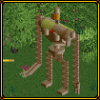
Is that a new diagonal support object? Looks good, though I agree that it would be better if you got the footers closer to the support.
Also, there's no way a boomerang will win a design as the featured ride. -

 Dark_Horse
Offline
Sorry to change the subject, but have any of you actually submitted a boomerang in for design? If not, then you have no idea if it will or not, so stop with the negativity. Like I've said, I have a few tricks up my sleeve.
Anyway, that looks real nice, Liampie. I'm not too sure about the yellow coaster though. The hill/curves just don't seem natural to me. I'm trying to picture riding that, and unless there's a chain lift coming up after the banked curve (hopefully i'm going the right way), it looks painful and not enjoyable.
Dark_Horse -

 robbie92
Offline
@Coaster King: Nope!
@Dark_Horse: Black or brown wouldn't work because footers are made of concrete, meaning that they should be gray. I wanted to say that for your screen as well.
To everyone: I fixed the footers, and this is a surprise project I started yesterday and am about 30-40% done with! -

 Dark_Horse
Offline
Couldn't concrrete technically be painted to say fit in a theme? Other than the footers looking out of place (which you seem to have fixed), that screen is rocking. BTW your boomerang was inspiration for mine.
Dark_Horse -

 robbie92
Offline
Why thank you! I also just want to note that none of us here want to be negative towards you. We are all here to support your efforts. That's the definition of a community. We just are trying to offer some advice to you. You have a very good start, but I think your concept is better suited to a park submission rather than a design. A design focuses not only on the atmosphere, architecture, and detail of the area, but the ride's layout itself. I've seen plenty of rejected submissions from the past that have had great theming and atmosphere, but the layouts, although original, were somewhat lacking, keeping them from getting a spot on the front page. What I'm trying to get at here is that if you're specifically going for a design submission, it might be best to try to do an original layout, rather than a clone. However, if you are willing to submit it as a park, than you should be fine. Again, we're not trying to be negative. We're just trying to help.
Good luck in all your endeavors
RobbieEdited by robbie92, 28 December 2008 - 01:35 PM.
-

 Dark_Horse
Offline
Alright thanks, Robbie. I prob will end up using some of the stuff I built, but the bench that coaster sits on is nowhere near enough room for a park. Maybe I'll add another coaster and make it a design.
Dark_Horse -

 zodiac
Offline
Liampie, the first screen is excellent. the only thing i don't like about it is how close it is to the edge of the map, but there really isn't much you can do about that. the second screen is okay, but it seems like it has a little less finesse compared to the first. i think it's the foliage on the big dirt pile the coaster's on. maybe some lighter green trees would help it. still, your work is very promising.
 -

 Katapultable
Offline
Both screens look good Liam. I totally forgot what Millenium Flyers looked like in RCTLL.
 -

 Milo
Offline
Nice screens Liampie, first screen is really nice apart from the map edge, the second looks pretty interesting as well although the chess pieces look a little off... if they were holding up another section of roof maybe that would help.
 -
 turbin3
Offline
Liampie, I really like the station and the colourness of the second one.
A small GCI-Woody.
-

 ACEfanatic02
Offline
Damn, RRP inspired a lot of people...
Liampie: Wow, that looks excellent. The coaster in the second screen looks a bit off, though. Is is a mine train?
-ACE -

 Dark_Horse
Offline
Yannik, that drop/helix combo is incredible, but the supports for the helix look a little off from that far out. Also, it would give it so much more with some terrain editing.
Dark_Horse
 Tags
Tags
- No Tags


