(Archive) Advertising District / Dump-Place
-
 19-April 07
-

 posix
Offline
http://www.nedesigns.com/contact/If I may interrup... I've just finished a large park in Loopy Landscapes, and I'd like to see how it rates...

-
![][ntamin22%s's Photo](https://www.nedesigns.com/uploads/profile/photo-thumb-221.png?_r=1520300638)
 ][ntamin22
Offline
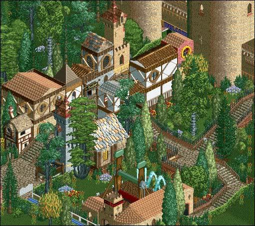
^ yes. try to make the buildings in the lower left more than rectangles with windows on every possible face. I do like that the row of buildings isn't just a straight line against the path edge, but it still looks rather awkward.
 -

 turbin3
Offline
Thanks!a tad blocky, but a nice start.
I will try.^ yes. try to make the buildings in the lower left more than rectangles with windows on every possible face. I do like that the row of buildings isn't just a straight line against the path edge, but it still looks rather awkward.

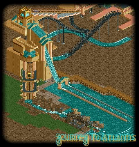
It's the entrance of the park.That bit of trackitecture looks rather interesting.

 Tags
Tags
- No Tags


