(Archive) Advertising District / Dump-Place
-
 19-April 07
-

 geewhzz
Offline
it's good, but just think, you could have had so much more WOW factor had it been finished. resist the temptation, folks.
 -

 Sey
Offline
Thank you very much for the comments guys!
Thank you Yannik! I really love them, too!
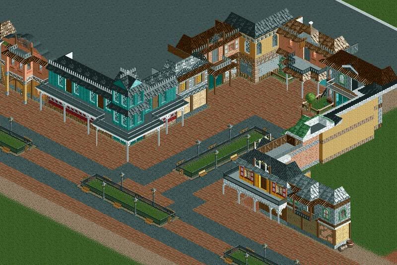
@thorpedo: Certainly I'll finish this park. The whole screen was meant to be a small "birthday-update"
@RCTFAN: Do you mean the 1/16 brick wall, which I used at almost every roof? Because I used the 1/8 Brick wall only once.
Thank you!
@Bacchus: Thank you very much, Bacchus!
Nice to hear something like that from you Xophe. Thanks!
@Turtle: If I won't loose interest in this project, I'm gonna finish this end of next year. And I'm not kidding you, if I say I built the BeNeLux houses within two
hours. But thanks.
@posix: Is that a positive argument or negative one? I'm really not sure.
But thanks anyway.
@Comet: Yes, the coaster was someway a bit bothersome. There's now another coaster standing in this area.
Thank you very much!
@Gwazi: Going to be changed soon. And there're also two other facades, so ... Thank you!
@nin: Same like Gwazi But thanks!
@Brent: I've shown a wrong picture of this, because the tree was already "deleted". Thank you very much!
@RCTFanB&B: Nice to hear that. Thank you very much!
@geewhzz: I'm very impatient and so this was meant to be a small update Resist the temptation to post unfinished screens? I'll try
Thank you very much! -

 RCTFAN
Offline
Sorry, yeah I ment the 1/16th brick wall at the bottom, along the path where there are two benches..... Hope that makes more sense.
 -

 Liampie
Offline
It's not totally identical to dutch architecture, but still it's the most similar I've ever seen. Really great job, I'm looking forward to more!
 -

 Cocoa
Offline
It reminds me of one of those crappy Japanese parks with terrible, crumbling theming and huge dilapidated concrete paths.
Not that that's bad, but whatever. -

 Midnight Aurora
Offline
A crappy park that you know is bad is still entertaining. It's like a bad horror film. It's brilliant, if only for the reason that somebody had to purposely and conscienciously try to make it that bad.
 -

 Todd Lee
Offline
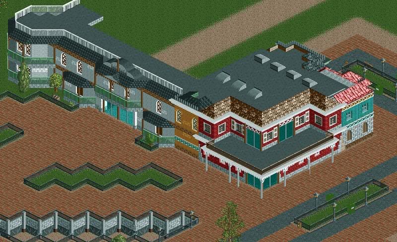
Like the facades, but somethings got to be done about that roof. Add some details...
 -
![][ntamin22%s's Photo](https://www.nedesigns.com/uploads/profile/photo-thumb-221.png?_r=1520300638)
 ][ntamin22
Offline
Here's the station to an unnamed coaster in a pirate themed area in my current project:

doesn't levis have these colors copyrighted?
I'm with MA on the roofline fences, ditch them. I'm alright with the bricks. I also rather like the barrels strewn about.Edited by ][ntamin22, 12 December 2008 - 08:22 PM.
-

 SGT BLOOPER
Offline
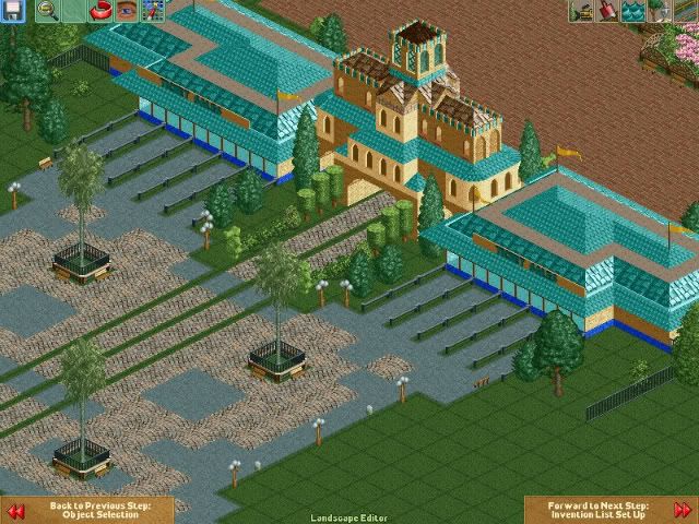
Entrance I did for a group park that died very quickly. Whether or not I'll finish it myself remains a mystery.
Comments welcome. -

 JDP
Offline
I don't like you and you don't like me. However, what you just stated there is funny as hell.A crappy park that you know is bad is still entertaining. It's like a bad horror film. It's brilliant, if only for the reason that somebody had to purposely and conscienciously try to make it that bad.
-JDP -

 geewhzz
Offline
That middle building reminds me of one at Cedar Point...is that where you got inspiration for it, robbie?
 Tags
Tags
- No Tags

