(Archive) Advertising District / Dump-Place
-
 19-April 07
-

 Cocoa
Offline
Your links take me to imageshacks home page.
EDIT: they work now.Edited by Cocoa, 01 December 2008 - 08:12 PM.
-

 JDP
Offline
^Yes I agree. I mean, it's either one of two things. One it's incomplete (then why both showing such a small screen) or two, it is complete but you're to insecure about your work to show a larger screen.
-JDP -

 thorpedo
Offline
i believe he just said that they were from a CCI that he submitted a couple of weeks ago?
 -

disneylhand Offline
^I think that is a different project.
Yeah they're good screens, FullMetal, but they don't show much other than your ability to use the ride tool. I think that's why JDP and ChillerHockey find them pointless.
-disneylhand -

FullMetal Offline
No, I submitted a small Concept Creation a couple of weeks ago. (It actually went up as a Design due to it's nature.) That project will be released as soon as a final verdict is reached.i believe he just said that they were from a CCI that he submitted a couple of weeks ago?
This is a different project that I've been tinkering with.
And JDP, I don't like posting large screens because 1) I feel like they give too much away (advertising, duh...), and 2) Because I am insecure about my stuff. Negative comments (rather than constructive ones) are the leading cause of "Project Abandonment." Negative comments get me discouraged, so I try to post small screens instead of large ones. (If I post big screens, people like you would pick out an insurmountable number of "problems".) But this wasn't meant to be anything special. I'm just trying to show people that I'm not just polluting the forums. I do have projects and such floating around...
@nin: Thanks! -

 Ozone
Offline
Nice use of the pagoda station, RCTCA. The pink on the coaster is an interesting choice, I'm not sure I like that. Good work though, keep having fun building what you envision.
 -

 Ripsaw
Offline
Tbh i love the pink and the station looks really nice =]
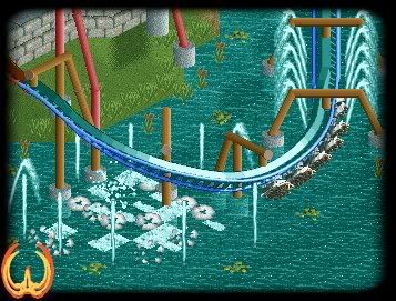
Heres a Zoomed in shot of the final water encounter on my new B&M Flyer Waukheon
-

 Splitvision
Offline
I don't like the mix of red and brown supports. The rest is great.
Sorry for the brightnessEdited by Splitvision, 04 December 2008 - 10:36 AM.
-

 nin
Offline

Nice! I've always been a fan of stand-ups, and yours looks great! nice colors. The pagoda looks nice, but the brick get bland really quickly, try covering it up or something. -

 Splitvision
Offline
I took the pic on my pc, and when I opened it in photoshop to trim it, it was really dark... so i brightened it. Then I viewed it on my Mac and saw that it was very bright. Conclusion: PCs suckIt's good, but why did you do that to the picture?

-

 Splitvision
Offline
It's already on brightest setting... Conclusion: all monitors in the world except for my PC is too brightConclusion: Adjust your monitor.

I would comment on the pagoda, RCTCA, but I don't know anything about LL...
 Tags
Tags
- No Tags


