(Archive) Advertising District / Dump-Place
-
 19-April 07
-

 Brent
Offline
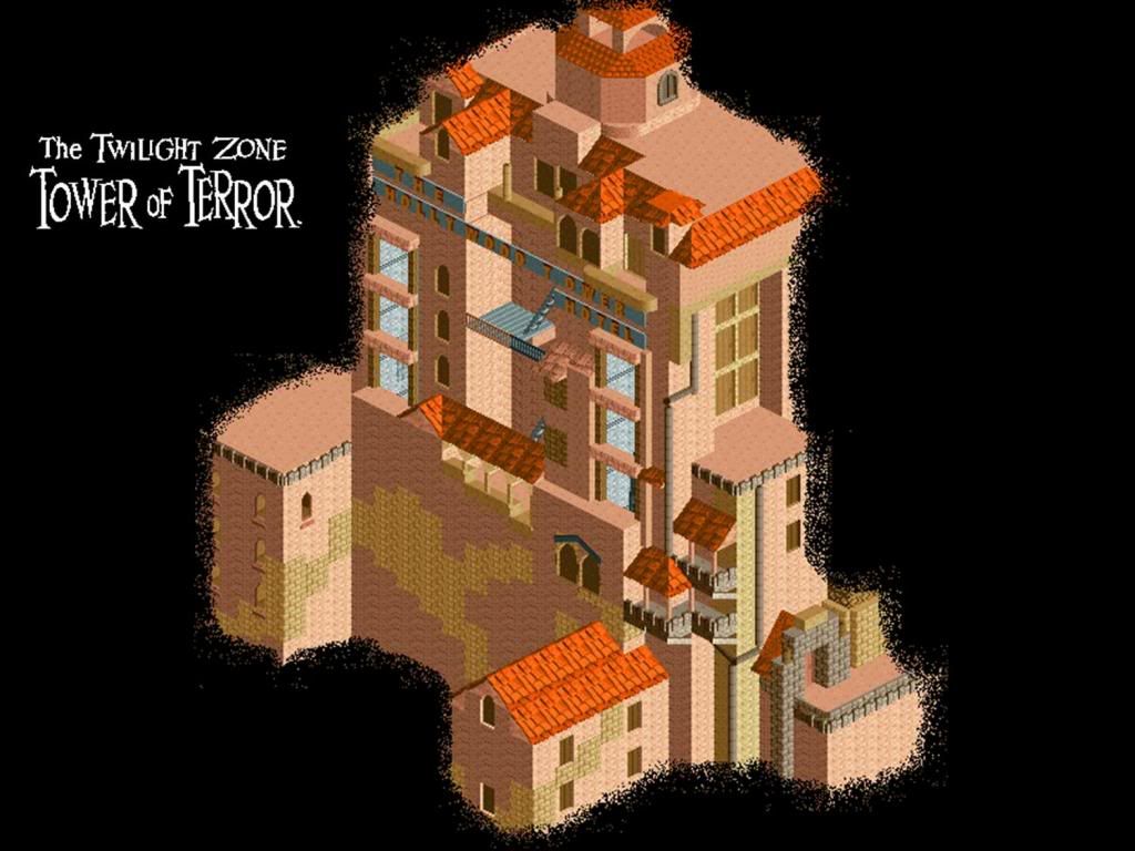
Too short for MS (height wise). Though had you not said that that's supposed to be a Disney park...
 -

 Gwazi
Offline
@Tycho - great start. i'd say spice the queue up a bit though.
@Werner - not too bad.Edited by Gwazi, 27 November 2008 - 02:37 PM.
-

 Cocoa
Offline
As for the mainstreet, all the buildings look good except for really the big white and brown one- it would look better smaller like the other buildings. The gates are amazing though.
 -

 Louis!
Offline
It doesnt have that Disney look. The buildings also seem too short, but the gates are lovelly.
 -

 Milo
Offline
Question:
Do I still have it? Anything close to "it?"
I would describe it as quaint.
Happy Thanksgiving!
haha awesome... I like it a lot but maybe try a softer blue than the one you have now.. -

 thorpedo
Offline
OZONE, i hate you. how you can make everything have so much freaking atmosphere in so little time i will never know.
that being said.. i would have to agree with milo's comment about the blue. try to make the blue from the path, flowers AND the windows all match up; it will look much more synchronized that way. -

 Nokia
Offline
love it ozone.
and nice ncs tycho.
but i think that a 4d coaster would look better than the wodden coaster. -

 Liampie
Offline
Looks good, but very unsmooth

And therefore not good.
Also, the layout leaves very little space for interaction with other things like paths, rides and landscape. -

 thorpedo
Offline
Thanks for all the positive responses so far guys.
hold on, hold on. this isn't asian at all is it? it's native american! i think i see a totem pole
feel free to correct me if i'm wrong. -

 nin
Offline
and nice ncs tycho.
but i think that a 4d coaster would look better than the wodden coaster.
Very nice indeed!
But keep the wooden coaster for the catwalk, it looks much better. -

 sfgadv02
Offline
Great screen nin, especially with no custom scenery. I'm not sure about that tree though, looks awkward.
 -

 Brent
Offline
While it could be layered a bit better, it's still a pretty nice attempt at it. I tried a couple years back but gave up (Surprise) so kudos on actually doing it.
 Tags
Tags
- No Tags


