(Archive) Advertising District / Dump-Place
-
 19-April 07
-

 Pudding
Offline
A new building I've built. It's just about the building itself. It's the mainbuilding of my mainstreet and will serve as Converence centre.
[img]http://http://img510.imageshack.us/img510/9287/bigbuildingtn1.png[/img] -

 Bacchus
Offline
A new building I've built. It's just about the building itself. It's the mainbuilding of my mainstreet and will serve as Converence centre.

Now it works
-

 Todd Lee
Offline
Thanks Bacchus!
That's a nice building pudding, although, it would have been a much better screen if it were finished. All the empty space around and in back of the building really takes away from your work. The building needed something in there to help compliment it. I'd love it if you posted the same screenshot, once the surrounding area was complete. It would be interesting to see a side-by-side comparison.
Edit: After looking at the screen a little more, I wouldn't have the entrance stick out into the path like that. Pedestrians are gonna walk right into the side of the poles. Nice work shadowing the path underneath it though! I'd set the building back a couple tiles, and put in foliage, flowers, etc.. between the building and the path.Edited by Todd Lee, 19 November 2008 - 03:49 PM.
-

 TheLegendaryMatthew
Offline
JPD:I think like around 30mphish.
Liampie:Thanks, Yeah, all I did was just make plain blocks at a certian height and then I customized each one. Thats what I always have done
oh yeah Pudding(best username) the building dose look a bit plain, but if you going for a Hollywood feeling, you may wanna add a sign or something.
-Matthew.K -

 Ripsaw
Offline
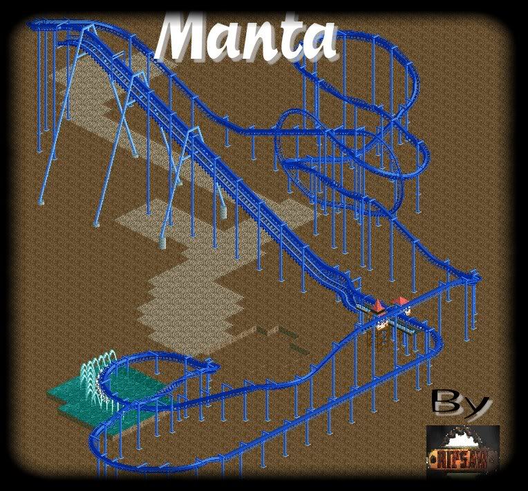
As a lil side project from ThorpePoint, ive decided to give the upcoming Manta a shot.
Heres the full overview of the layout, i think ive got it fairly accurate, as it is hard without diagonal inversions and to do a wing-over on flyer you have to use the inline twist which make it a bit more stretched out.
I am aware that there should be another station and a s-bend on the back of the station, but ill add that later atho only one side will be operational, as i want to keep this peepable .
Well heres the pic.
Hope you guys like it.=] -

 Midnight Aurora
Offline
Get rid of the MCBR and shorten up that whole last part that goes off to nowhere forever.
 -

 Midnight Aurora
Offline
Sorry... I didn't know it was a recreation. ....My bad.
I'm not up on my real coaster knowledge these days. Carry on. -

 Todd Lee
Offline
See, this is the problem with 80 % of recreations in rct. You have to sacrifice the flow and looks of a coaster, to get it "right". That's why I will never do one.
 -

 Comet
Offline
I think it's obvious enough that it's unfinished.
It looks nice, only thing I'm worried about is the pacing in that first part. Looks like you have the same size rise as drop.
 Tags
Tags
- No Tags


