(Archive) Advertising District / Dump-Place
-
 19-April 07
-

 Maverix
Offline
Here's a pic from my new(and hopefully better) park.
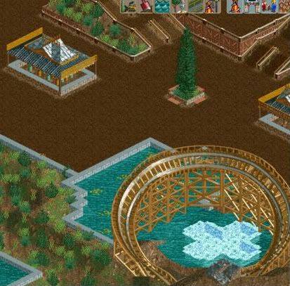
And can somebody tell me how to fix this problem.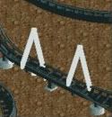
-
![][ntamin22%s's Photo](https://www.nedesigns.com/uploads/profile/photo-thumb-221.png?_r=1520300638)
 ][ntamin22
Offline
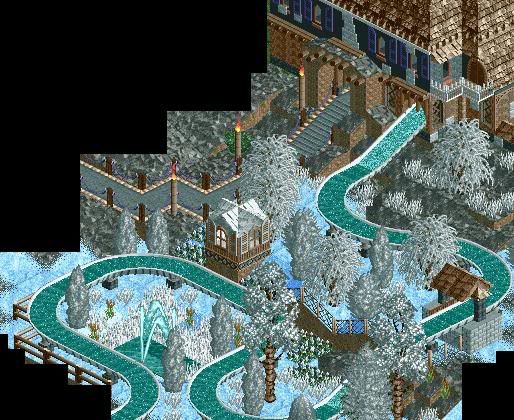
eh, it isn't as bad as nin makes it sound. you could stand to lose a square or two off the width of the path, yes. try not to just fill in the landscape with scattered bushes and reeds, though. right now it looks a little empty when it seems you're trying to recreate a decent-sized fully operational amusement park. if what you're going for is realism, typically all of the areas that the guests see are maintained if possible. usually the paths have plenty of things to see and do, ideally on both sides; this maintains an illusion of theme if there is one and makes the park look fuller and more complete as a package to guests.
 -

 Comet
Offline
To get rid of it use map object manipulation under miscelaneous in 8cars.
Paint the ground under the white supports a texture that hasn't been used in the park yet.
Then check the remove object box.
Then check the large object box.
Then check the color of ground you chose.
Then apply and it should be gone. -

 Magnus
Offline
Build the same object again in the exact place of the white object (make sure the orientation of the object fits), then delete both by right-clicking.
A lot easier than map object manipulation.
-

 Bacchus
Offline
looks good, but i think you should make some of the plants green. it's too white now.
 -

 ACEfanatic02
Offline
Change the silver birch trees -- their trunks look like shit in brown. Other than that, nice job. Good use of CC-d trees. Maybe change some of that grass to brown as well.
-ACE -

 Maverix
Offline
Here's a few new screens from my new park. Note foliage is unfinished.
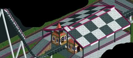
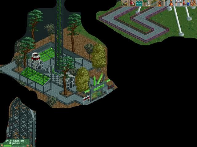
I hope you like it.Edited by Maverix, 19 October 2008 - 09:19 AM.
-

 Camcorder22
Offline
Yeah...I wasnt really paying attention to who had posted and thought it was Ripsaw for a second.
 -

 Cocoa
Offline
^LOL I was sure it was until I saw the building in the lower left corner.
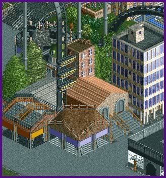
Anyway, Nokia, You shouldn't build like LL in RCT2- it doesn't seem right, and it doesn't look that good. -

 Sey
Offline
Hm, I don't like the whole screen, you could have made that in three minutes!
It's just... It doesn't look lovely and that's what I'm missing. -

 ClockworkMyr
Offline
Is that RCT2 or LL? I can't really tell right now.looks kinda like barcelona?
oh and.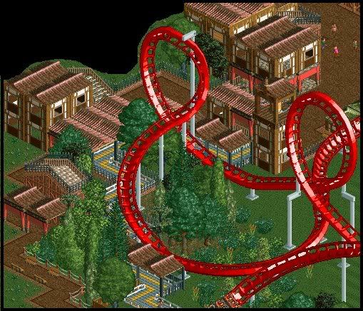
unfinshed in some places
its about at 85% now :]
 Tags
Tags
- No Tags


