(Archive) Advertising District / Dump-Place
-
 19-April 07
-

 rct2_tom
Offline
Is this a good lay-out? (it must be a realistic lay-out for a winter park (yes i know, i'm a little bit early).
-

 JDP
Offline
Realism huh? Get rid of the double lift for one. And you can thank me later for this:
One
http://rcdb.com/ig198.htm?picture=1
Two
http://rcdb.com/ig355.htm?picture=1
Three
http://rcdb.com/ig113.htm?picture=10
Doesn't get anymore realistic than this. Schwarzkopf at his best.
-JDP -

 Six Frags
Offline
This is a park entrance I have build. It's the first time for me posting anything here on NE!

It's surrounding is unfinished though, and I'm not sure about the sides of the building.
Your park is shaping up to be very nice pudding!Teaser of my parks trainstation!

- Pudding
lol @ your username btw
SF -

 CedarPoint6
Offline
^^^ Two lifts are fine. Big Bend- SFOT, now defunct.
However, you'll want longer trains (3-4 cars), longer brake sections (at the end and before each lift) and perhaps more interaction between the two sections or within each other. As a trademark of these, he usually wraps a mid-level corner around the lift. Try that. -

 robbie92
Offline
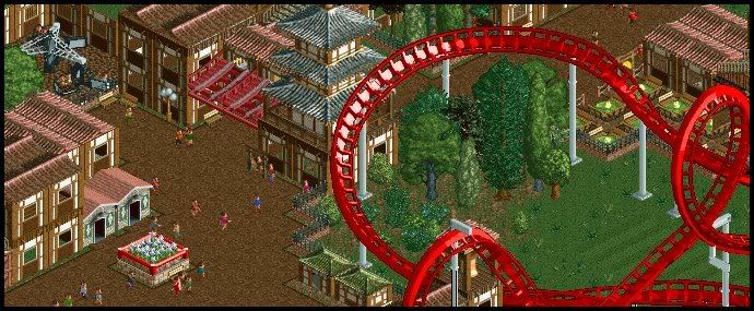
I like the right half; it looks clean and simple. However, the left half looks pretty boring with the same oriental walls stacked on each other. However, it's good for no CSO.
 -

 zburns999
Offline
The atmosphere in that screen is outstanding. Everything seems very well put together.
 -

 Xophe
Offline
I thought that was an LL screen at first. I like it, especially the right side. I think the left side is a little dark though, maybe because of all the brown. I would suggest replacing those flowers with some other, lighter greenery to brighten it up a bit.
lol at those 2 peeps staring up at the pagoda!! -

 trav
Offline
That looks very nice Nokia.
It's not much, but what country does it look like it'd be from?
I want to know if I'm heading in the right direction before carrying on. -

 Xophe
Offline
^ Not sure. It looks sort of eastern european to me. I like it though - great architecture and colours.
 Tags
Tags
- No Tags


![][ntamin22%s's Photo](https://www.nedesigns.com/uploads/profile/photo-thumb-221.png?_r=1520300638)

