(Archive) Advertising District / Dump-Place
-
 19-April 07
-

 trav
Offline
It's a good start, but it's a little basic and doesn't hold my interest for very long. I also don't like the brown. The blue and orange is alright, because they contrast, but the brown just doesn't fit in. Neither does the red actually.
 -

 Cocoa
Offline
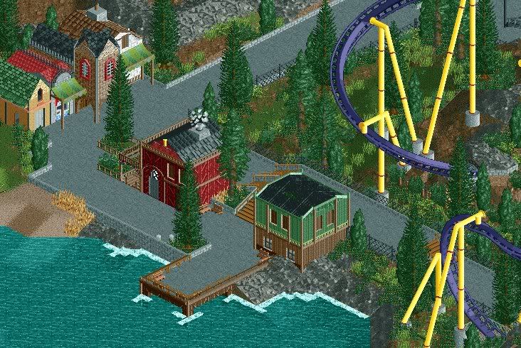
LL semi-project I've been working on. Inspired by Annapurna (great design by the way). Sort of just for fun, but I need some criticism for these (unfinished) screens:
Sort of shops/plaza for the coaster, but the entrance won't be there.
Semi overview- there's a small bit behind (very unfinished screen).
I guess I basically need some advice on where to go from here, what could be improved, etc. -
 zburns999
Offline
Layout seems really mediocre. You know you did something wrong when the ride ends with a huge lift hill (and the ride isn't terrain based). The ride spends way too much time underground too.
That first screen is really cool though, in concept. -

 Cocoa
Offline
Yah, the layout was terrible and I knew that from the start. Basically I built track where I wanted interaction and terrain elements, and then filled in the rest, which is a terrible idea. I think I'm sticking with what I've got for now. Plus, the straightaway/helix at the beginning drains so much power I have almost nothing left to work with.
 -

 FK+Coastermind
Offline
Sey, love it. the colors are so bright but really refreshing. great job
Rapipo- i think that section in the first screen would ROCK as a dueling or racing woddie, but its just doesnt work in this layout
Xin-i think your problem right now is the same as what it was. you have defintly improved a great deal from what you were, but you have yet to finish anything substantial. you keep on starting more and more projects. IMO, you really need to focus and finish something which we can all download and open and look at in game.
FK -

 Milo
Offline
That's pretty good stuff Rapipo but as FK said, with the interaction you have there and what's being built around it, trying out some sort of racing woodie layout would probably work well... so I'd say your theming is fine, just redo your layout and maybe even make it a racing/dueling type coaster. I like what you've done with the que too.
 -
 Sey
Offline
Thank you for the comments guys!
Ok, I'm gonna change the tree ahead the building ivo. But I can hardly make the airplane bigger, because the house top isn't that big, and it wouldn't look very well.
][ntamin22: I thought to build with modern structures and glass would look like the aerospace industry, so I decided
to put the roof there.
It doesn't really make any sense, but I think it fits and I like it there. -

 Cena
Offline
The Colors aren the first to chose If I would make it, but in your case it really works well, Good job, the structure is nice. Overall a good building. Hopefully the rest is also this good
-

 zodiac
Offline
the only thing i really don't like is that the structure is so simple. don't be afraid to mix it up a bit. but you've managed to make the colors work well, so i tip my hat to you, sir.
 -

 nin
Offline
^ a little too well imo.
Pink for the coaster and station...? Mix it up a bit, and I'm thinkin' candy. -

 Nokia
Offline
not to bad really.
just maybe use like a darker pink of something.
maybe even a red?
idk play around with it.
-

FullMetal Offline
That's the idea.I'm thinkin' candy.
 This design was modeled after Dominator at Geauga Lake, and inspired by JKay's Divinity Ridge.
Thanks for the comments, guys. I think this is my best architectural work to date. -

 Video_Kid
Offline
Well, usually, isn't any work of someone's their best to date? Since they're improving everytime?
 -

 Fisch
Offline
The archy is nice but the colors are totally destroying it. You could let this look so good with better colors!
 -

 BRTeller
Offline
I think I may have gone a bit overboard! I would just like to say, this project has been the least aggravating building, that I've ever built! It's been so much fun, and I can't just stop, I keep wanting to add more!
 I think this will be the absolute best project I've ever done, and I plan on making several more towers!

Any ideas on what I should add is highly appreciated. I'm really excited to see where this will go! -

FullMetal Offline
Holy crap, that's huge!
I don't particularly like the overhang in the second screen. I think it should be lower, but that's just me. The rest looks good though.
And I'm glad your enjoying yourself. I would've gotten bored stacking that many blocks. -

 Xophe
Offline
Holy crap, that's huge!
So much potential there haha!
I take it you haven't finished the big tower on the left?
The one on the right is interesting, kind of mesmerising haha! The colours are sort of disgusting though - brown and pukey green... with a nice clashing bluish green. It would be a lot of effort to change them though I guess.
 Tags
Tags
- No Tags
![][ntamin22%s's Photo](https://www.nedesigns.com/uploads/profile/photo-thumb-221.png?_r=1520300638)

