(Archive) Advertising District / Dump-Place
-
 19-April 07
-

 Fr3ak
Offline
Reminds me a little bit in Faceman's Duelling Dragons.
But it looks nice
Edited by Fr3ak, 08 June 2007 - 02:01 AM.
-

 Louis!
Offline
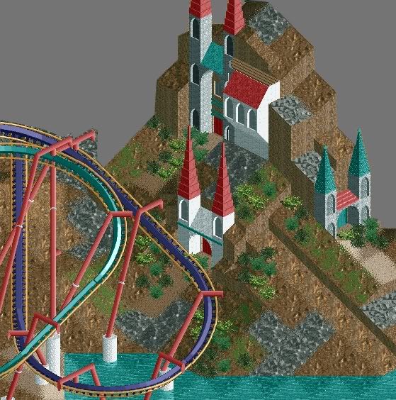
Unfinshed Screen:
Caledor, occupied by the High Elves, situated in the hill-side. Access to Caledor through gateways only. -

 zodiac
Offline
Woah, a lot to take in.
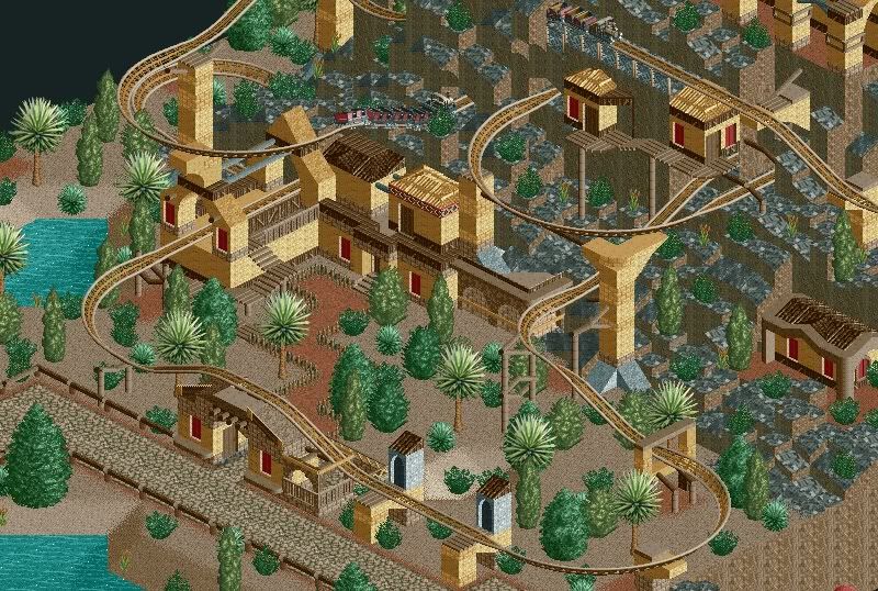
ivo- Foliage needs a bit of work, but I know personally it's hard to theme sand areas with trees. Maybe try some cactus or something.
Pineapple- Liking the colors, and the supports were pulled off nicely, but they look a bit flimsy. The landscaping is a bit boring, try to spruce it up a bit. Same with the building.
Mifune- Nice, taking the FK style of building are we? I agree with geewhzz, the supports are a bit weird on that cobra roll, but the rest is hot.
Oh, and speaking of geewhzz, liking what's in your sig. -

 Ling
Offline
@Pineapple: Looks pretty good... sort of empty though...
@ivo: The screen has nice architecture, but the foliage just isn't doing it for me. Looks like a fun ride though. -

 geewhzz
Offline
@Pine, I think you need to stroll over to rcdb.com and pick up some pointers on supports.
 -

 lucas92
Offline
ivo: your screen's very nice, creative.
Pineapple: Your coaster looks too unsupported, and I don't like how the landscape makes a line (just strange)...
Geewhzz: Nice sig, foliage's what best in it.
-

 gir
Offline
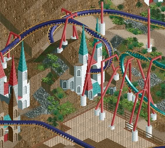
the supports need serious work. some of them clip the track, and im not sure what's up with the ones that hang over the track.
 -

 Louis!
Offline
The one's that clip the track are the best I can do. Those are the only ones that do.
 -

 Carl
Offline
If it took you a while to get the timing right, then why didn't you show a screen including the trains? I would have liked that. ANyway, this looks good, though unfinished, and I agree that the supports need work. I realize its hard to get them to lineup, but alot of other parkmakers have dones it successfully, and been rewarded for their hard work, so I suggest you keep working at it.Took me a while to get the timing but...
-

 Comet
Offline
I love it, my only suggestion is get the footers off the path.
I think it would look much more clean if they were.
Don't see the problems with the supports in this particular screen though. -

 Fr3ak
Offline
Yep, great, but don't put the supports on the path.
Something from a new, at the moment unknown project

 Tags
Tags
- No Tags


