(Archive) Advertising District / Dump-Place
-
 19-April 07
-

 Dr. Doom
Offline
InBev? I hope it’s what I’m thinking it is.InBev presents...

Coming soon...
Anyway, I really like it. -

 Sulakke
Offline
I somehow love that screen, MF72. The station looks great. I don't really like the building on the left, though. Some parts of that building are too low imo.
 -

Wicksteed Offline
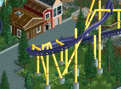
new coaster in a new park named IKARUS. scenery is unfinished
[...]
umm, yeah....that´s it
The Coaster itself looks good, but i don't think the colours will work. you've got brown/green surroundings and then you have this blue/turquoise coaster and station, and grey path with it, and the trains are red....it's just too much.
everything else is fine though. -

 K0NG
Offline
Station from a terrain woody I'm working on.
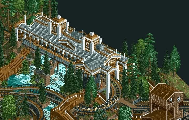
Pathing, landscaping and foliage all unfinished. -

disneylhand Offline
That station has an incredible atmosphere that I've never seen in RCT before.
-disneylhand -

 Liampie
Online
That looks really weird, but cool also.
Liampie
Online
That looks really weird, but cool also.Edited by Liampie, 28 September 2008 - 02:09 AM.
-

 Tolsimir
Offline
You always use these CSO which don't fit in RCT. They destroy the fantastic screen.
 -

 trav
Offline
Why has the coaster got a catwalk? Wooden coasters don't need them.
And it looks too busy, it's ok having lots of details, but when those details just end up looking cluttered, like they do here in my opinion, it just doesn't work. -

 Maverix
Offline
It's alright but I would use the darker yellow.
Is this going to be a park with the water coaster? I really wanto to see a park from you, since Chamios looked so great.
EDIT: Here's a shoot of my new desgin.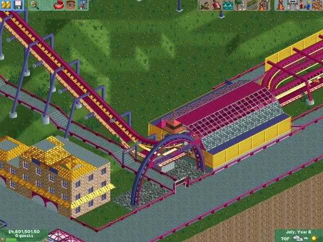
Edited by Maverix, 28 September 2008 - 02:54 PM.
-

 Bacchus
Offline
Is this going to be a park with the water coaster? I really wanto to see a park from you, since Chamios looked so great.
yes, it's in the same park
and i've tried the darker yellow, but i think this looks better. -

 ChillerHockey33
Offline
Who uses the scenery catwalk pieces now-a-days? lol
Your supports are going through the track, wtf?
Your transfer track is definatly not functional.
I dont like your buildings.
What the fuck does "quantum begins" mean anyway?Edited by ChillerHockey33, 28 September 2008 - 03:20 PM.
 Tags
Tags
- No Tags
