(Archive) Advertising District / Dump-Place
-
 19-April 07
-
![][ntamin22%s's Photo](https://www.nedesigns.com/uploads/profile/photo-thumb-221.png?_r=1520300638)
 ][ntamin22
Offline
some crazy stuff, jimemo. the first one is too brown, but the buildings all look fantastic.
 -

Kevin Enns Offline
It looks like an extremely interesting looking ride (cue MA). I also think the name is clever, midly amusing, and exceptionally long, all good things. I am looking forward to it.
Frankly, the worst thing about it is that Project Blue is cancelled.
p.s. Look at me posting in the AD! rhyme! -

 trav
Offline
Robbie, that actually looks immense.
Although, take the bench out of the way of them doorways. -

 Cocoa
Offline
One of the first things I've liked from you, except for that cool dark ride building thing. However, why is there a lamp over the door farthest to the left, and the same with the benches covering the arch doors?
 -

 Cena
Offline
Looks great Bacchus
 Keep up this good job
The next thing I will do in Dutch: (Because then he understands my tips better)
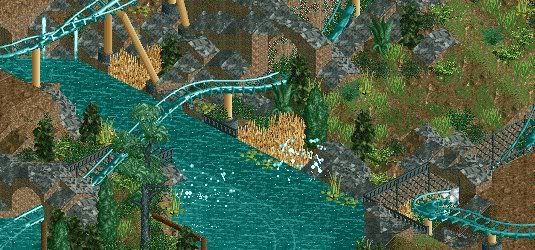
- Ik zou de footers grijs maken, dat staat iets mooier
- Ik zou iets minder met die quaterblocks van die grijze rotsgrond werken, nu ziet het er net te uit. Het is wel gaaf en je bent hier goed mee. Maar echt mooi wordt het niet als je het teveel doet(heb ik zelf ook gemerkt met die attractie gebaseerd op Pilgrims Plunge in Mysteryland).
- Die boom die links onder in staat moet je de bast even bruin kleuren (indien dit mogelijk is).
Dit waren mijn tips, succes (Y)
Ik begin steeds meer fan te worden van je werk.
Now I will try this to translate it in English so you can understand it als well
- You should make the footers grey, that will look better I think.
- Work with less quaterblocks of the rockground, this is to much. (I talk out of experience, see the attraction that is based on Pilgrims Plunge in Mysteryland).
- The tree in the bottem left you should make the bark brown. I think that will look better
-

 thorpedo
Offline
JiMeMo - that bridge (the eyeball one? assuming that it was it's supposed to be) is freaking awesome.
 -

Wicksteed Offline
the transition from water to land looks very unnatural, because it's just a straight line. -

 Bacchus
Offline
Cena: Thanks! Maybe i'll add some mud blocks instead of rocks. but i'll leave the footers and the tree.
Maverix: Thanks! and Chamois is already finished, i've submitted it 2 weeks ago. (so i think i will get the answer soon)
Wicksteed: I'll try to make it less straight.
 Tags
Tags
- No Tags
