(Archive) Advertising District / Dump-Place
-
 19-April 07
-
Xcoaster Offline
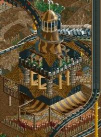
@zburns999 - It's pretty good, but the structure looks a little too flimsy. Rotoshakes are pretty beefy rides. Also, there should probably be a single floor under the seats, since they load similar to a standard Top Spin, with bridges going out to the ride. That allows for the area directly under the ride and loading area to be empty and free for water, and thus, jets which shoot up at the riders when the carriage is flipped over at the bottom.
I really like the shark stall on the right side. -
 zburns999
Offline
^Yeah, I remembered you had done one so I downloaded it to take a look. I tried doing it my own style, but it looked too bulky, so I basically went back into Firefly, took out a pad of paper, and sketched the basic form of what it should look like in game. I tried to deviate from how you did it a bit, but your design actually is pretty spot on so I stuck with it for the most part. I think in the end this will end up like the Swats and Screamin' Swings. The design will be perfected to the point that everyone's version looks the same, except with different theming.
 -

Xcoaster Offline
^ You honor me, but you're thinking of CP6's version. If I recall, his is about as close as you can get though. Granted, I've planned on doing one a few times before, and I probably will at some point. If I did one the main difference between yours and CP6's is that it'd be quite a bit bigger. It seems like his was even smaller. -

 Liampie
Offline
I like it Comet, but if it's a minimap, you better use the available space better than this: don't fill the blank spots with trees, use it wisely.
 -
 Timothy Cross
Offline
A comment for Comet! Really like that screen. Loven the wheel chair access ramp to the left of the stairs!
 -

 Sey
Offline
It looks nice Comet, though there's not much to see.
Sey
Offline
It looks nice Comet, though there's not much to see.Edited by Sey, 19 September 2008 - 07:16 AM.
-

 Marshy
Offline
I found some inspiration today and since I don't hve any unfinished projects lying around I decided to do this little mini map...

...whenever I get spurts of inspiration I'll probably just add some land to another part of the map (it's big just all black tiles) do something like this again and then hopefully I'll find a way to connect them all in the end to form a park.
That disabled ramp is pure gold -

 dr dirt
Offline
RRp. love it
zburns. great to see you building again, it looks good.
comet. I like that
GoldenTower. The first screen and the water breaking through the dam sorta thing are awesome. -

 ACEfanatic02
Offline
RRP: Sexy, sexy woodie there. And Steve's right -- go finish that solo you've been working on.
Comet: Nice, but you went a bit overboard on the path elements, I think.
-ACE -

 ClockworkMyr
Offline
GoldenTowers, don't use Mini Golf stations for footers, that's only legit in RCT1, you have actual bases in RCT2. But that's a great idea for using Impulse track for supports, looks extremely realistic.
i cen haz mai xbox magazeen nao plz? -

 JiMeMo
Offline
no cable for 25 days! yay! I got some rct done though...
It kind of looks like I was on crack while I was building most of this stuff.
Building in the entrance area.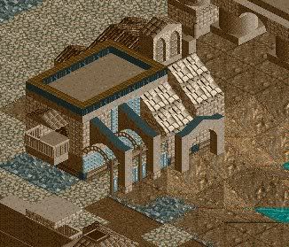
Factory building.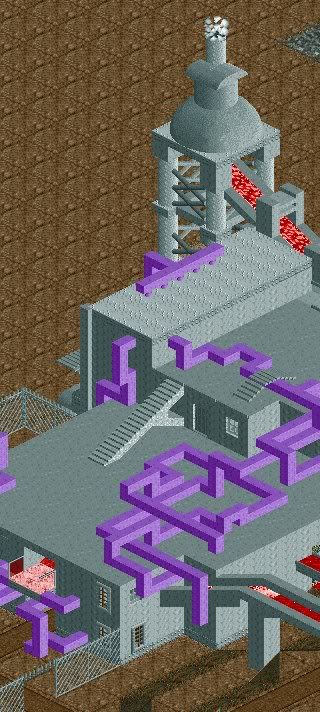
Monorail station. I really don't know what I was thinking when I built this, but I like it.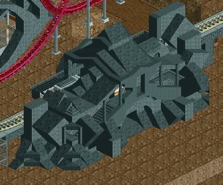
Finally, concept for a bridge in the park.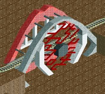
-

 robbie92
Offline
Looks great! I love the eyeball bridge.
Coming soon to an ad district near you:

Comments are welcome! -

 Bacchus
Offline
Great screens Robbie!
maybe add some more white water, and change the ground type into muddy grass.
 Tags
Tags
- No Tags


