(Archive) Advertising District / Dump-Place
-
 19-April 07
-

 ACEfanatic02
Offline
Agreed.I actually think it's rather hideous.
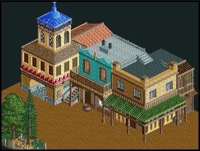
It's pieced together with objects that have no relation to one another and architectural elements that make no sense -- portcullis windows and glass, rope fence on the balcony, etc.
Cena, the point with architecture is not "detail." The point is to make a building that looks like it serves a purpose, and looks like it could exist without being horrendously ugly. Slathering a boatload of textures onto a cube does not bring you anywhere closer to that goal.
-ACE -

 Camcorder22
Offline
^Since it just sits there, it makes more sense to me if the platform is up.
Looks really nice, possibly the most realistic custom one I have seem. The rapids ride going under it looks like a nice addition as well. -

 posix
Offline
crap, everyone's getting so good! FINISH YOUR PROJECTS!!!
dimi, i love that water ride. -

 JDP
Offline
Yeah that should do it. At the same time try and open up the landscaping too so you don't loose the feel to the area.Hmm. How about if I lower the rapids one more?
Oh, and you also missed a yellow deco piece at the bottom left section near the ladder.
-JDPEdited by JDP, 17 September 2008 - 12:11 PM.
-

 Steve
Offline
Dimi, the last few shots you have shown have blown me away. Great, great job.
and trav, the swing looks pretty good. Not feeling the colors so much, though. And if this is the last screen NE is going to get for awhile from you, why not make it a finished one? Still, it looks lovely.
 Tags
Tags
- No Tags


![][ntamin22%s's Photo](https://www.nedesigns.com/uploads/profile/photo-thumb-221.png?_r=1520300638)


