(Archive) Advertising District / Dump-Place
-
 19-April 07
-

 Camcorder22
Offline
You might want to try another texture for the red. Not sure if you were planning on keeping the grid land, because it doesn't work at all there.
 -

 JJ
Offline
I doubt you'll finish this dude
And your obession with white and that red is getting annoying
-

 Comet
Offline
That's just because he has been doing the same entrance plaza over and over again.
Anyway it looks great nin. -

 rK_
Offline
what wrong with RCT3?
i think it looks good. the arrow in the background looks odd to me though, its the angled straight track that's throwing me off. -

 MF72
Offline
what wrong with RCT3?
i think it looks good. the arrow in the background looks odd to me though, its the angled straight track that's throwing me off.
Thanks. Well, if you look at Magnum, near the end, it doesn't need to be banked on those turns, and I just thought it looked cool, and because I didn't think that I'd need to bank it to 0degrees, because right after, I'd bank it again. So that's mainly why. -

 MF72
Offline
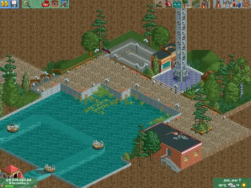
Tolsimir: I really like the screen, although I am not too sure about the single planter on the path. Maybe add a few more around it? Looks a little random right now.
 Tags
Tags
- No Tags
