(Archive) Advertising District / Dump-Place
-
 19-April 07
-

 geewhzz
Offline
just place a clock, or something that gets rid of them and lower it with object manipulation in 4cars.
Although the land can't be changed easily after it, it still looks for a much better product. If you use scenery you save a ride data slot. -

 Sey
Offline
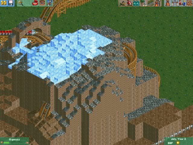
Five Flags?Still playing some RCT2 tounge.gif heres a screen of some recent work of mine ^
^^
But still looks interesting^^Edited by Sey, 27 August 2008 - 03:23 PM.
-

 bernts matte
Offline
Sey: Yeah it sounds like Six Flags
 but this is a remake of my favorite and lost park i made in RCT 1, before i know joined the RCT community and heard if Six Flags
-

 Camcorder22
Offline
^Best screen in this topic.
bernts matte, that grey roof thing with the circles looks rather cool. -

 Midnight Aurora
Offline
There's a shit ton of tricks you could use RMM. Trust me. Play around with it, and youll find the right answer.
 -

 Bacchus
Offline
I've got 2 screens from something i'm working on:
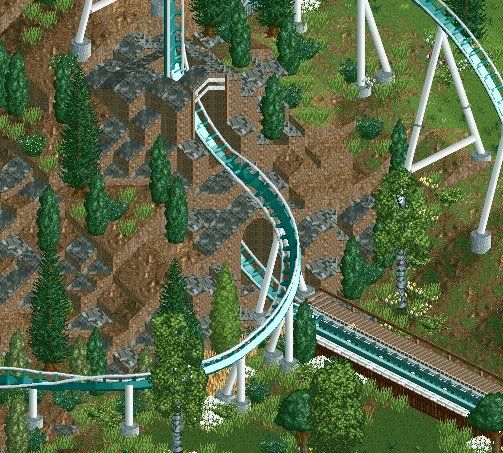
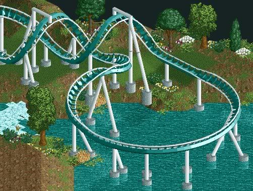
(last screen is slightly unfinished)
I hope you guys like it .
.
-

 TheLegendaryMatthew
Offline
How do you get the track to go backwards without it reversing to the same side? Nice coaster!
 -

 rK_
Offline
i think the white looks horrible, the sidewalks look great though.
rK_
Offline
i think the white looks horrible, the sidewalks look great though.Edited by rK_, 29 August 2008 - 06:02 PM.
-

 CedarPoint6
Offline
nin,
That's really weird. I attempted nearly a duplicate of that entrance form for a park one time. It never saw the light of day, but man, that was close. Cool looking, but the pink roofs don't really help much.
Maverick, not bad, although it would be nice if you could make it seem less quarter-based, and more like actual RCT squares. It's interesting, however... just make sure you have foliage further down and it doesn't get too monotonous. -

 Goliath123
Offline
Also you can see where you have put in toons blocks and that also makes it look weird.
Maybe try adding some foliage? -

 Camcorder22
Offline
nin, I dont understand why there is a double white line inside double yellow lines. Cant think of when that would happen. Since it seems to be somewhat realistic based I thought I would point that out. Other than that theres not much to see.
Bacchus, thats a really nice looking landscape/coaster. -

 Cocoa
Offline
i think the white looks horrible, the sidewalks look great though.
not really. the white works well.
 Tags
Tags
- No Tags

