(Archive) Advertising District / Dump-Place
-
 19-April 07
-

 Sey
Offline
Nice screen Fr3ak, is that an other new design? =)
I fucking love that!
Petrol, yours is also very good, I've always liked your ideas.
Is it from Alameda Pier? -

 JiMeMo
Offline
Mind showing anything?

I'm not sure what I showed before...
just in case you wanted to know what areas I would be doing.
Miami, Key West, Everglades, Space Coast, and St. Augustine.
Entrance and monorail station.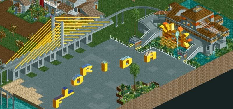
Orange Grove/Farmy entrance area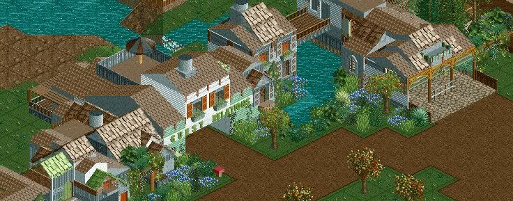
Big full-service restauraunt, Osceola's.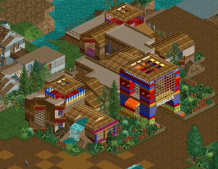
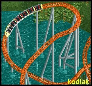
Stormrider, in the Key West area has begun the painting process.
Miami has also begun painting...
This park won't be done for a loooooong time.
and about the other pictures I showed on the last page.
For the second picture, it's supposed to look messy. Think south of the border, deserted town... with vampires. that ride motorcycles. I've never seen "From Dusk til Dawn" but I believe it's plot is something like that.Edited by JiMeMo, 23 August 2008 - 11:39 AM.
-

 Tolsimir
Offline
i hope not, cause the first bm flying coaster were built in 2002 magic world is in 1994 or sth like that.I pray this is Magic World and not another design, cause I really want to see that.
-
 Highball
Offline
i like the sun, i like the orange grove entrance area, but everything else i dont really like. if i hadnt read the descripiton, i wouldnt have known that last shot was miami. i think youre making too much use of the art deco blocks and it makes the entire screen feel monotonous. i personally think stormrider would be better off in the miami area seeing as the national hurricane center is located there. otherwise, a new show building more in the key west style would be my suggestion.
 -

 Sey
Offline
if i hadnt read the descripiton, i wouldnt have known that last shot was miami. i think youre making too much use of the art deco blocks and it makes the entire screen feel monotonous. i personally think stormrider would be better off in the miami area seeing as the national hurricane center is located there. otherwise, a new show building more in the key west style would be my suggestion.
I think Highball has described it well, that's also my opinion... -

 Gwazi
Offline
1) Why not make your own topic? You have enough screens...
2) I agree with Highball completely. I have been to Miami, and that doesn't look anything like it. And I agree about the Key West style show building instead of Stormrider as well...
3) I love the Orange Grove screen... -

 Kumba
Offline
Way to represent Florida JiM, I love it
And it's nice to see you survived Fay or at least stayed above water. -

 Cocoa
Offline
Yay Jimemo! Awesome screens-it's interesting that you do your archy first then paint it.
 -

 JiMeMo
Offline
Gwazi - I don't really like how that park is coming along. I started this park a loooong time ago. way before Micro Madness, which is when my building really started to improve. sooo I didn't want to make my own topic
Kumba - Stupid Fay and her stupid rain for a week straight...
Rapipo - I have this theory that if it looks good in one color, it will look even better with multiple colors. And I usually end up using like 300 different colors on my buildings, so I find it a little easier that way. -

 zodiac
Offline
that's in my honor, isn't it?
i like it, it's pretty good. the only perk i have is the transition from the slope to the turn. looks weird.
 Tags
Tags
- No Tags


