(Archive) Advertising District / Dump-Place
-
 19-April 07
-
 Sey
Offline
Better version?
I know you have changed something there, but that's really really not enough...
Work on this. -

 dr dirt
Offline
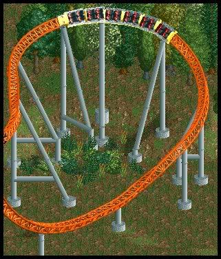
The rapids are too white, change them to the aqua blue. The same type of foilage are different colors in the screen, especially the grass. Sooth out the landscaping and it will look better.
 -
 MF72
Offline
But it does make it less interesting.
Less interesting? If anything, I believe it makes it more interesting. You're able to look at a park from a peep's eye view, and there's a 3D approach which makes it more interesting. -
 Highball
Offline

something ive been (re)working on. theres not enough done to start an ad topic on... yet. -

 rK_
Offline
the balcony looks really short for the scale of the front of the buildings. i dont know what to think of the jungle palms yet...
 -

 Highball
Offline
theyre not supposed to be flowers but rather foliage such as shrubs or whatever. i colored them green so that they would help fill in the jungle without standing out.I like the buildings but why green flowers
-

 Milo
Offline

Another screen from my design I showed before. Slightly unfinished.
don't know if you use codex or not inversed but instead of those purple cubes, some stacked abstract fences would work nicely there. Good stuff though -
 Gwazi
Offline
Just noticed in your screen, inVersed (thanks Milo): At the top,the black path is cut into individual squares by the slide. You can fix this by building the path OVER the slide, then lowering it to the level you want with Codex, if you use it.
Still a great screen. -
![][ntamin22%s's Photo](https://www.nedesigns.com/uploads/profile/photo-thumb-221.png?_r=1520300638)
 ][ntamin22
Offline
@ inversed- do want.
and nice tip, gwazi.Edited by ][ntamin22, 16 August 2008 - 08:26 PM.
 Tags
Tags
- No Tags
