(Archive) Advertising District / Dump-Place
-
 19-April 07
-

 Xophe
Offline
That's amazing, Turtle! I love the windows on the grey brick building - the crossed angled pieces at the top are a nice touch.
The only thing that remotely bothers me is those little bits of support underneath the diagonal wooden coaster track. If you zero-clearance an invisible path just under there you can get rid of them. -
 jusmith
Offline
The red boats work excellently here for me, and you always use those wooden roof objects and tiles so perfectly.
This is beautiful. -

 Fisch
Offline
@Turtle:
Lol, a lot of comments for only one pic here!
I can totally feel how your using the boats to get a good contrast here.
They take a way the onesidedness in terms of color but another color for the boats' seeds would take away the onesidedness from the boats.
Maybe you still could add some more red somewhere at the building.
Try a red flag on the top of it and what about putting an observation deck with a partly yellow tent as roof on the same level as the path is right next to that boat on the upper right.
That should make it look even better and it would give that picture all the main color something needs to look refreshing and interesting!
@inVersed:
It looks like one of those realistic style parks wich are not meant to have theming. What about realistic parks with theming?!
What about something like this:
http://cache.rcdb.co...cmax/p12540.jpg
or this:
http://img177.images...toorlandlm5.jpg
Why don't you try to give it a special theme because if you don't your park will just dissappear into the crowd.
Look at real life.
Nobody besides guys like us who love coasters would know that there is a Disneyland in Paris without the thing that makes it special (the theming!).
FischEdited by Fisch, 30 July 2008 - 12:19 PM.
-

 Nokia
Offline
something you might see a lot of in the near future.
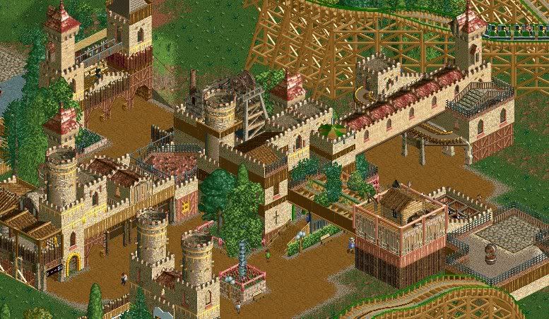
basicly just me nin and louis!'s group parkk bittchh
so feedback is always nice. -

 zodiac
Offline
did you get another copy of the game, or are you just showing the screen?
looks amazing, guys. keep it up. -

 bernts matte
Offline
Wow nice screen, looks really good if you ask me, but i think the 2x2 mine objects don't really fit in there.
bernts matte
Offline
Wow nice screen, looks really good if you ask me, but i think the 2x2 mine objects don't really fit in there.Edited by bernts matte, 30 July 2008 - 03:10 PM.
-

 Fisch
Offline
Get rid of the mine thing please.
The architecture looksn quite nice but I can't imagine this to be in a real themepark somehow.
What I really don't like is the color of the flowers.
They are usually used to bring some more contrast but this just doesn't look right here.
At the end I have to say that the track's colors, the train's colors, the theme and the fact that it's done without CSO pretty much remind me of Mordred.
FischEdited by Fisch, 30 July 2008 - 03:35 PM.
-

 Nokia
Offline
well zodiac jj sent it too me.
flowers are supose to be yellow but died.
and yes i really loved Morded.
but i started building this before that was even out, so?
oh and i removed the mine thing.
 Tags
Tags
- No Tags


