(Archive) Advertising District / Dump-Place
-
 19-April 07
-

 ACEfanatic02
Offline
Look closer. You can see all the way through the building. There are no floors there.there are floors just all the same colors
In a related issue, the windows are too close together. You need a little bit of blank wall between them (vertically, if not horizontally.)
-ACE -

FullMetal Offline
I like the hotel, robbie, but IMHO, it looks much more like the Claremont than Del Coronado. I've seen both in person. Other than that, it looks good. But I'd suggest using a different object for the beach chairs. They look like they should be inside the hotel, instead of out. -

 robbie92
Offline
^Well, yes. The Hotel Del only was an initial inspiration for a victorian hotel and the white walls-brown roof color combo. The Claremont was the model for the actual structure and design, along with the white wall, which were part of both.
robbie92
Offline
^Well, yes. The Hotel Del only was an initial inspiration for a victorian hotel and the white walls-brown roof color combo. The Claremont was the model for the actual structure and design, along with the white wall, which were part of both.Edited by robbie92, 26 July 2008 - 07:35 PM.
-
 jusmith
Offline
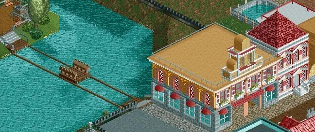
Another screen from me and Nokia's duo for a contest. Parts are unfinished, mainly details and supporting, and some of the done supports are messed, but those will be fixed soon.
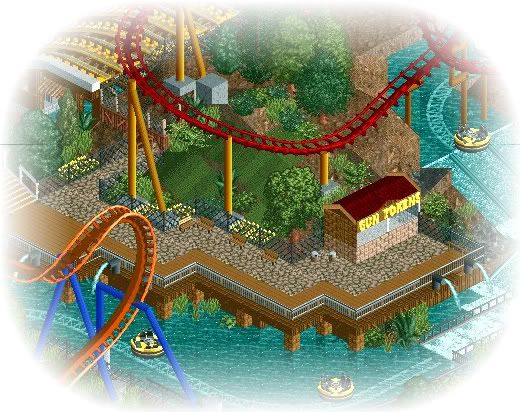
gah, trying to get back into rct2... -

 geewhzz
Offline
I'm a fan. The only thing I don't like is the rapids. Real rapids rides don't really go out in large open waters like this. If they do they have man-made barriers for the boats to bounce off of. It's minor, but something that if fixed it could really improve the realism.
 -

 Marshy
Offline
jusmith, the screens nice but the 2 coasters colours clash with eachother, and the yellow trackitecture in the top left looks weird :/
 -

 Comet
Offline
That sorta reminds me of Xophe's park for some reason.
Anyway it looks pretty nice except for the rapids as said, and good luck with the park, I'm hoping we can get ours in on time but I don't think it'll match up with this. -

 Nokia
Offline
WHOOO!
i love what you've done.
and i see you changed the colors on my invert :]
its all good.
yeah i was gonna mention the rapids to you.
maybe put like guard rails or something?
love the tracetechture thing on the station.
great work! -

 nin
Offline
Remy, why not just make a new topic?
Anyways, I like the raft-thing but your building are just squares, and the roof tops need to be worked on a bit. -

 Fisch
Offline
I'd say make the roof tops black. That's not important for the guests but black is a color which you mostly don't have in your park's landscaping, foliage or buildings and because of that it adds a good contrast for the viewers and makes the whole thing look better and it even gives more atmosphere.
The raft looks cool but I think it was better if it wasn't squeezed into the corner.
Go on with such stuff!
Fisch -

 Comet
Offline
Some more of Classix just to let everyone know it's not dead and it should be done by the end of the summer...
And I know there aren't any benches, garbage cans, etc, so no need to say it. -

 spartan
Offline
I dont really like the custom footers, its a good idea but dont look very good were they connect to the ground. Also land looks bare and could use some flowers/bushes
 -

 Fisch
Offline
Same as Spartan said and also try to change the terrain texture at some points, add some more flowers and try to include the slide more into the lanscaping.
Also the buildings are very undetailed. I know you can do it better as on the screens.
Fisch
 Tags
Tags
- No Tags

