(Archive) Advertising District / Dump-Place
-
 19-April 07
-

inVersed Offline
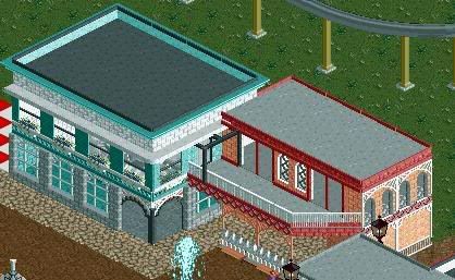
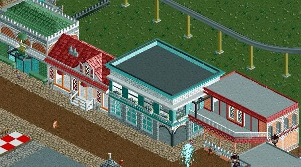
A few too many wall textures on one structure for my likings. Aside from that, great screen zodiac. -

 ACEfanatic02
Offline
Remy: It's blocky. Very, very blocky.
Ditch the detail for now, work on your form first. Once you've got that down, your architecture will be ten times better.
-ACE -

FullMetal Offline
Chapelz, nice first screen. Can't say the same for the second though. It seems to be missing something.
Zodiac, I didn't know you tinkered with LL. I'd say stick with the wood textures, and change the color of the cars on the invert. They look like turds. Literaly. -

 Cena
Offline
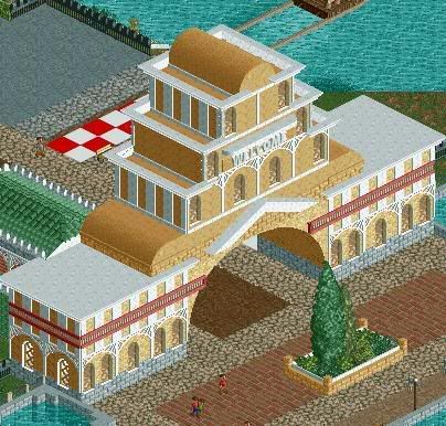
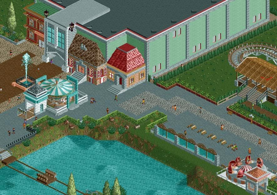
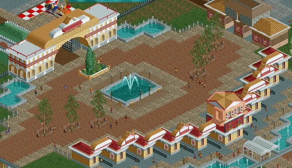
New entrance building (ticketcontrol) because the previous one was ugly, hope this one is better :G. -

 Fisch
Offline
I like the ticket booths but that entrance building is a bit too big. The way it looks just doesn't work and doesn't fit to the other things around the entrance.
I also like the mainstreet but please try adding some more colors to it. It's not bad how it looks now but it looks a bit pale.
For example shutters and flowers are always a good way to add more color to something.
Fisch -

 Sulakke
Offline
All your work is the same and has the same boring colors, details and shapes.
Sulakke
Offline
All your work is the same and has the same boring colors, details and shapes.Edited by Sulakke, 26 July 2008 - 11:03 AM.
-

 robbie92
Offline
I'm not a huge fan of the actual entrance building, but the ticket booths are great!
Here's just an old screen from about six months ago of a hotel for a park I was making. It's based both on the Hotel Del Coronado and the Claremont Hotel in Berkeley, CA.
 Tags
Tags
- No Tags
