(Archive) Advertising District / Dump-Place
-
 19-April 07
-

 ChillerHockey33
Offline
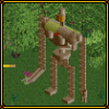
It is realistic. Ever hear of a Condor?
But yeah it propbaly doesnt work because the arms are made of scenery. -

 Liampie
Offline
There is not enough space at the base of the ride for the arms to turn, there is no system for lifting the arms up, the tower is made of bricks... And there is one axe two much. A conder turns around two axes, this one around three.
 -

 Kumba
Offline
Some really amazing screens here guys, I am impressed by most things that have been posted in recent months.
I don't have much to add, but I have been board and added a final ride to my old Darren's Movie World LL park. Here is Predator!
-

 CedarPoint6
Offline
I love the first part of that, Darren. I feel like the mid section, however, is a little rambling. I'm not sure what to suggest, exactly, because I do like the use of terrain. Looking forward to seeing what else you'll do with it.
 -

 Kumba
Offline
Yeah posix was kind enough to change it back since I am releasing stuff again.
Here's the park DL: Darrens_Movie_World_7_23_08.zip (506.9KB)
downloads: 151 -

Xcoaster Offline
That first screen is awesome. I like the second, but I think I'll need to see more before I judge. -

 RCTFAN
Offline
Both screens are very impressive, I particularly love the meandering feel of the second.
 -

 CedarPoint6
Offline
Is this from that open source project? Looks pretty interesting so far-- I'm quite curious about seeing the surroundings of that first screen... I can't quite make out how it all comes together.
 -

 chapelz
Offline
thanks guys. it was going to be for clockworks, but it is extremely unlikely i will make the deadline. also, zodiac that is the best ll screen i have seen in a while.
 -

 Xophe
Offline
rcwhiz - Looks good but as CP6 said, the round bushes look weird stacked against the building. Maybe try using a less round bush so it isn't as lumpy.
Remy - that's quite impressive! I don't see why people think it's that unrealistic to use bricks - it could be painted to look like that.
Kumba - the layout looks intriguing, but I hope you're gonna improve the treeing.
Chapelz - both those screens exude atmosphere. The second one in particular is lovely.
zodiac - I really like that! It stays away from the typical beige and brown LL style. The brown stone walls and pinky-brown tile path are SO over used, it's nice to see a different colour scheme.
 Tags
Tags
- No Tags


