(Archive) Advertising District / Dump-Place
-
 19-April 07
-
Xcoaster Offline
It does seem like putting them on the inside of a turn would be bad for the footers, since it'd be putting them in tension, which is bad for concrete. OTOH, on the outside it'd be compression, which is good stuff.
But both ways have been built, so what do I know. -

FullMetal Offline
You're using Image Shack, so what I suggest is to select the thumbnail URL instead of the regular URL. There is also an option you can select that will automatically resize your image. I suggest the thumbnail, though, as it will load faster at NE, especially for dial-up users such as myself.Do any of you know how I can make my pictures smaller? They're huge for some reason.
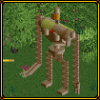
But like Spartan said, the supports look good, but there's nothing more to see. It's great from a peep perspective (mysterious and hidden amongst trees), but for us parkmakers, you might want to try something other than a ground shot. -

 Lloyd
Offline
Xin's a parkmaker? O shit!1!...but for us parkmakers, you might want to try something other than a ground shot.
-

 MF72
Offline
^lol!
Xin: No problem. I don't have much done in this park, other than the three coasters. So when I have some more progress, I'll be sure to show them here. -
 rcwhiz11
Offline
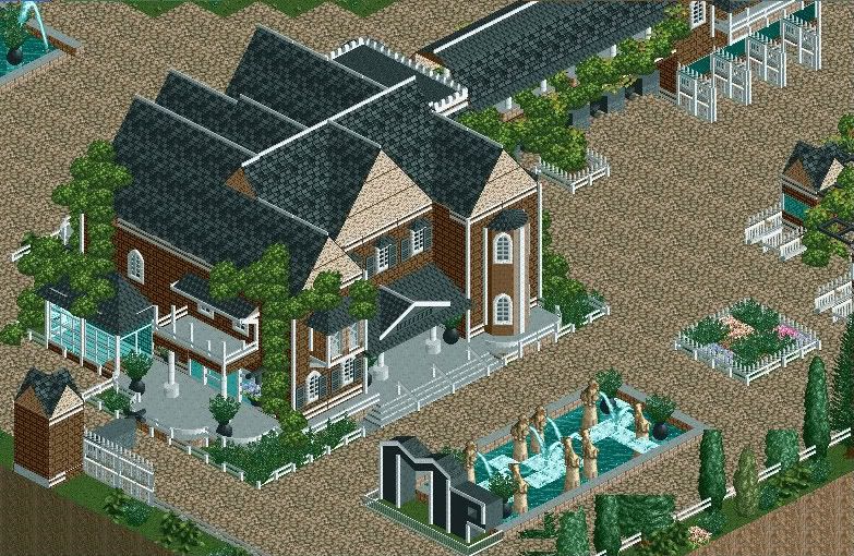
The entrance to my new park I'm working on. The screen is still a bit unfinished and I'm planning on fixing those trees. -

 CedarPoint6
Offline
It feels like those bushes on the building sides are a little aggressive. It doesn't look overly bad, though-- it is rather interesting. Besides that, the only thing I really dislike is the big letters, which look kind of out of place compared to the refined nature of the rest of the screen.
 -

 RCTCA
Offline
Heh, reminds me sorta of a church. Nice work, and i agree with Cedarpoint6.
Keep it up!
--RCTCA-- -
 Highball
Offline
Damn, I really like that. It reminds me of an old New England manor or something. Nice job.
 -

 JJ
Offline
^ Cos someone else mentioned it on another forum... I didn't think about it until I saw that post
So I just copied their comment =P -

 Liampie
Offline
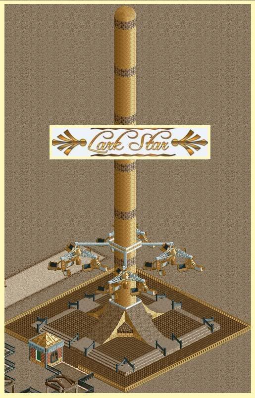
As I said it's not realistic, and I think it would look cooler if you move the cross with the carts to the top. And why is it brown?
 -

 Louis!
Offline
i think it's too tall for how wide it is. i know it's tall in real life, but it looks out of proportion here.
rcwhzz - i love it but the letters spoil the screen.
 Tags
Tags
- No Tags

