(Archive) Advertising District / Dump-Place
-
 19-April 07
-

 MF72
Offline
Thanks a lot Ge-Ride, I'll see if I can get that cheat to work. Other times I've tried it I was unsuccessful. How would you suggest putting some scenery?
 -

 Nokia
Offline
i think you should check out some LL parks before you start building because they will help out a lot.
 -

 MF72
Offline
Thanks, and I actually did, I looked at inVersed new park, and I looked at one of Fatha's at the bottom of his parkmaker page, and some other pictures. I really wanted this to come out good. If you want to see more buildings just ask.
 -

 Nokia
Offline
me and jusmiths duo thing for rcpro :]
[unfinshed in parts.]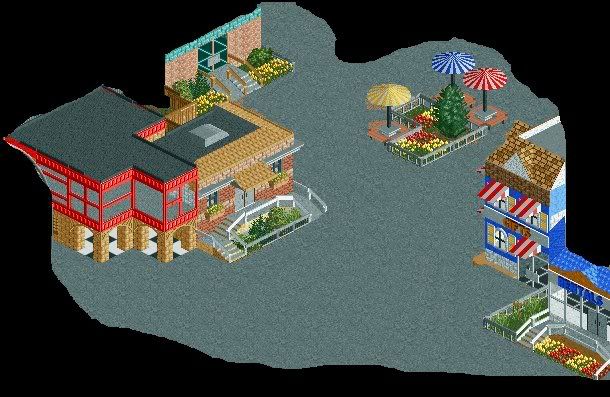
WOO 300th postt :]Edited by Nokia, 19 July 2008 - 08:03 PM.
-
 jusmith
Offline
Looks good, man. Looks like I need to fix something on my stuff from this angle lol.
 -

FullMetal Offline
RRP's Sea World Atlanta is one of the most amazing LL parks I've ever seen. It's definitely one to look at if you need some inspiration for an LL park.Thanks, and I actually did, I looked at inVersed new park, and I looked at one of Fatha's at the bottom of his parkmaker page, and some other pictures. I really wanted this to come out good. If you want to see more buildings just ask.
Otherwise, the screen looks good. It's pleasant to look at, and it's something I've never seen before in RCT3. I think that the direction you're headed could turn out very nice, or it could turn out like shit. Let's hope it's the former. -

 MF72
Offline
^ I hope it's the former as well! Yeah, I heard that was great, it's just that I can't get good pics of the park. Is there any way for me to get some? The ones I've seen are too zoomed out for me to see any buildings. I can't seem to find my LL disc, so I can't open it up. The thing is that I can't get the buildings to look anything to look like LL would. There are only 6 wall textures and all of them are rock, If I build through the ground, it just builds a gaping hole in the wall, unlike in LL where it made an arch. Plus, I want to make windows with the ghost ride, but I can't because I run into the same problem as above. But I'm working hard to make this look good without those things.
 -

FullMetal Offline
Keeping with the LL trend, I found some old screens of my PT3 LL project that I tried to do when I lost my RCT2 disc. Seeing them made me consider at least finishing the project and posting it in Place-To-Release-Your-Parks-Land, or send it in for CC or something.
Misery Meadows
This is the entrance, leading into the first area, Salem. The Twist is called Hocus Pocus, and the tropical looking bridge leads to an area called Black Beard's Bay.
This is the back half of the wooden coaster in Salem, called Black Magic. The building just beyond the station is a restaurant, and I forget what I called it. At the bottom corner of this pic, there was going to be a bridge that would lead to Silent Hill, and from Silent Hill, you would venture to the Grimm Mine Co. -

 MF72
Offline
Cool, thanks, those pics should help out a little bit. Again, I REALLY wish I could have those ghost ride windows. Although I guess I could ask a custom scenery maker to make some for me. That would definitely help out.
geewhzz, were you talking about my picture?Edited by Sternkrieg72, 19 July 2008 - 09:10 PM.
-

inVersed Offline
Xin, I realize that both of those screens on incomplete, but I really am not too fond of them. In the first screen, the colors are all over the place and the architecture lacks both thought and detailing. Furthermore when I look at that screen, I feel no atmosphere whatsoever. In the second, aside from what i mentioned about the first screen, I am also not a huge fan on the layout or the foliage selection. Just out of preference i don't really care for how the layout touches the ground so much, in fact you even built the station directly on the ground. The layout itself looks a bit awkward and flat in a lot of places. About the foliage, I dont think you pulled off 1x1 flowers here. They are very hard to work with in the first place and I have seen them used nicely very few times and this is not one of them. The foliage in its entirety looks generally dull and it sits on a very flat terrain which makes it more difficult to look intriguing
From what I have seen, I like your RCT2 stuff better it shows more skill than this -

 Gwazi
Offline
meh
Could be better, but hey, what can I say. I haven't built anything in a long time. At least you're doing something. -

inVersed Offline
not a huge fan of the architecture but I quite like the lay out. I reminds me of a quality GCI coaster. I would recommend that you use the articulated wooden coaster trains for the sake of realism -

 MF72
Offline
Nokia: How exactly would you suggest making it?
inVersed: well, what would you suggest to do about the archy? Also, I will change the trains, didn't even think about it.
 Tags
Tags
- No Tags


