(Archive) Advertising District / Dump-Place
-
 19-April 07
-

 postit
Offline
Wow. Everyone has gotten really fucking good since I last checked! Seriously, I am very impressed by the quality of the last few pages.
 -

 jusmith
Offline
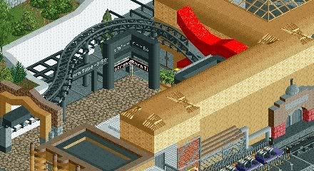
I like the use of the double track as the neck of the guitar, and I like the theming of the inside. The details everywhere are really effective, although it seems a tad cluttered, but it may be just the angle of the screen.
Is this not from Disney Studios Hong Kong though, or is it something different? -

 Nokia
Offline
thats i must say is a great screen.
agree with zodiac on the edges though.
all looks lovely. -

 Cocoa
Offline
dlh-looks good- i haven't been to mgm since i was 5 but it seems like you executed it well.
ivo- it's really nice, but it still strays away from the atmosphere/architecture that was already there... sort of. anyway, keep going-it's really nice. -

 JJ
Offline
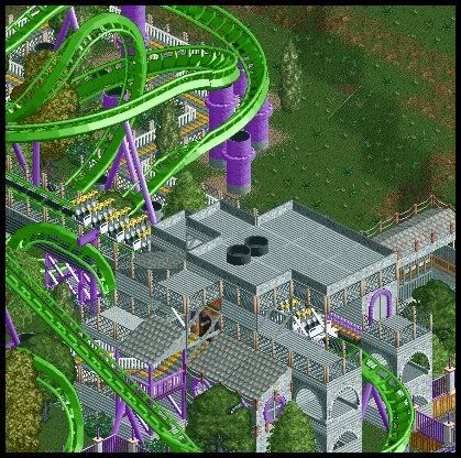
Not my choice of screen btw... I would have shown a full screen but nokiaa chose one which is unfinished
Edited by JJ, 13 July 2008 - 02:59 PM.
-

 Lloyd
Offline
That's what i thought.Is this not from Disney Studios Hong Kong though?
Regardless, i loved it last time i saw it, and i still do. -

 J K
Offline
Kong I meant it's a different theme that looks fresh. It's a good thing.
Hey Zodiac. Get in touch soon. Sure we could rustle something up. -

 jusmith
Offline
JJ: You've actually made those gross supports look ok, good work.
Me -> Status: about 85%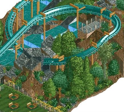
Can't decide if some sort of path or object cover over the picnic tables would ruin the look or not...Edited by jusmith, 14 July 2008 - 01:50 PM.
-

 geewhzz
Offline
^yeah, but we don't.
looks great, as always jusmith.
the only thing i can say is the chairlift supports sorta get in the way of the screen, maybe lower them to the bottom of the map?
also, what's with the fenced in 2x1?
hope to see it submitted as it looks fantastic.
 Tags
Tags
- No Tags

