(Archive) Advertising District / Dump-Place
-
 19-April 07
-

 K0NG
Offline
It gives off that theme very well.
Thanks...that's what I was wondering.
I wasn't sure if it was too much...or......
It's hard to be objective about your own stuff, ya' know?
What looks GREAT to me might look like crap to others...
Thanks for the feedback..guess I'll use this on another park
sometime when it fits the theme.Edited by K0NG, 10 July 2008 - 11:53 PM.
-

 Nokia
Offline
looks nice.
if this is for clockworks.
i dont see that being bulit in the 70'sEdited by Nokia, 11 July 2008 - 09:30 AM.
-

 JJ
Offline
It WAS not is... Since he scrapped it and he couldn't show this size screens if it was for that ...
 -

 Cocoa
Offline
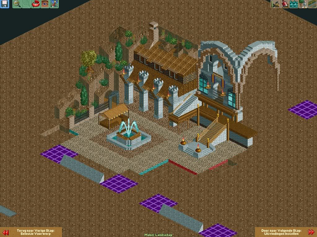
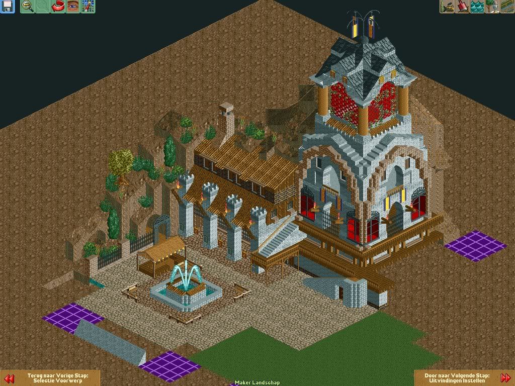
That is so grand. I love it. Just the different colored crazy paving looks strange- if it's meant to be a shadow it can't be all around the fountain.
Cocoa
Offline
That is so grand. I love it. Just the different colored crazy paving looks strange- if it's meant to be a shadow it can't be all around the fountain.Edited by RaPiPo, 11 July 2008 - 01:51 PM.
-

 ClockworkMyr
Offline
Pretty nice, although the large wooden fence should be replaced with something else or removed. But everything else looks quite good.

-

 ivo
Offline
@rapipo: it was just for some variation but i will look if i can make a good shadow from it.
 -

disneylhand Offline
The variation of the path around the fountain is a nice idea, but the two paths are too similar to look as good as they can in RCT.
-disneylhand -

 J K
Offline
Sulakkes screen and Ivo's are some of the best I've seen for a while. I'm also liking how different Kongs work is. Really nice refreshing screens.
 -

 K0NG
Offline
looks nice.
if this is for clockworks.
i dont see that being bulit in the 70's
I'm just curious as to why you'd say that you don't see that being built in
the 70's. I mean..we DID have flowing water and electricity back then..
Disney had MUCH more elaborate theming than that long before 1978
as well.
I'm just asking what you mean.
And, JK...different from what? My OWN stuff or, just different overall.
Because I build like this all the time.
Either way, thanks for the comments.
And, ivo's screen....dude...that's fucking NICE...can't wait to see how you finish it up.
Although...I AM curious as to how you're going to tie that all together...
I'm sure we'll see soon enough.Edited by K0NG, 12 July 2008 - 12:41 AM.
-

 Torn@do
Offline
I'm not as good as you guys but i want to now: how is this layout?(one of my first hacks)
i would love some good advise
-

 Nokia
Offline
^layout looks okay
^^ idk it just doesnt seem like 70's archtechture. it doesnt even look like todays arch. i mean most buliding dont have pipes comming outt of them, if they do they are hidden or on the roof.
but the buliding still looks nice.
just not 70's looking.
-

 DelLagos
Offline
O.O
Holy shit!
This looks fuckin awesome!
Very nice archi, beautiful details!!!
I only dislike those red fences under the roof...
 Tags
Tags
- No Tags


