(Archive) Advertising District / Dump-Place
-
 19-April 07
-

 ivo
Offline
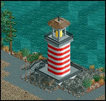
The best thing i have seen from you! Only change the white things like the others sugested or change them into brown.
 -

 DelLagos
Offline
@Louis: Okay, thank!
@JJ: Thanks
@Marshy: Thanks, too.
@gir: Thanks, I will look what I can do!
@RaPiPo: Thanks!
@Technique: Thanks! And I keep it up!
@Sey: Thanks!
@ivo: Thanks! Okay, I think I will change them into brown... -

inVersed Offline
I'm a big fan of the custom fences around the exit path. Very nice touch. Great screen overall -

 lucas92
Offline
Maybe include white trims all over the roof and not only on the top? I can see you used brown trims on sides of the roof, white would fit better.
 -

 thorpedo
Offline
this might be a little late.. but kenneth. your merry-go-round might be one of the most beautiful RCT2 structures i've ever seen.
 -

 CedarPoint6
Offline
That's very nice. Quite clean and well-composed. I think the wooden fence in the back actually looks pretty nice. Keep it up.
 -

 K0NG
Offline
This is something that I was building for a contest entry....then, I had a brainchild
for something else in the park that was too much the same color scheme....
So, I abandoned this to focus on the other thing.
I keep looking at this and thinking that it's not all that bad.
It's a station/entrance that is supposed to be sort of like a tour
through a water and power plant.
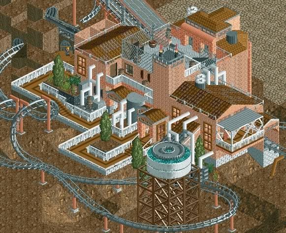
It's seriously unfinished....because I decided to abandon it because of
the clash with something else that's more important to my theme...
But, I keep looking at it and thinking that I can use it on another project.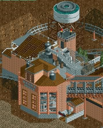
I just wanted to see what you guys think of the embryo of what I was
going for here.
All of the 'piping' will change to fit and the 'water tower' will be probably
THE most detailed part of this.
I'd appreciate REAL input here...not just the "K0NG SUCKS" crap..ok?Edited by K0NG, 10 July 2008 - 10:52 PM.
-

 K0NG
Offline
Yeah...my bad
Doing three things at once and I thought I'd included them...
There are two now...thanks for pointing that out.Edited by K0NG, 11 July 2008 - 03:20 AM.
-

 CedarPoint6
Offline
That actually looks really good. I can't say anything about the coaster layout, but that theming is very nice. It gives off that theme very well. I like the square windows used as elongated vertical windows. This is something I could definitely stand to see more of.
 Tags
Tags
- No Tags

