(Archive) Advertising District / Dump-Place
-
 19-April 07
-

 FK+Coastermind
Offline
nice screen Carl. love the pinkish building. looks great and the coaster looks cool. i like the atmosphere, my only worry would be that i feel like ive seen this from you before. i love the simplicity and cleaness of your work, but i feel like you have the same theme as Big Timber Creek in this shot, but with much cripser detail. try not to get stuck in the same rut.
FK -

 Milo
Offline
Wolfman, JJ, Nokia, Xin, whoever else is continuing the ongoing off topic bullshit.... it stops right here right now. Any more posts about this will be deleted.
Nice screen there Carl, I've always liked your style of building and it's nice to see more parks that are peepable these days .
.
-

 jusmith
Offline
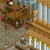
Xin, it has too much of the same colour and the same roof. Mexico is full of colour and has different varieties and shapes in architecture.
 -
 turbin3
Offline
@Xin: The colour's aren't so good, but the architecture is well.
Later there will be a hall, that the track is indoor
-

 Wolfman
Offline
The archy itself is very nicely done. But I have to agree with jusmith, too much of the same color. Probably go with white walls on one or two of the outlying structures. (Not the tilt an whirl, it matches the ride.)
The poles sticking out the side of the structure, below the roofline? Well, you can either loose the ones that stick out the front, or out the side. Because the poles are supposed to represent "rafters". And rafters don't intersect with other rafters or it weakens the whole structure. Keep the ones that are shortest distance across the structure. That's the way it's done in real life.
Then there's the brown trim. The pattern is concidered a Roman Classic pattern if I'm not mistaken. But I might be getting too enamered with the details. I like the planter in the courtyard that is shared by the ride. You might want to balance that out, in the empty area to the left, with a simular sized fountain, to strike a balance in the archy. Seems empty there.
Other than those minor details... It's looks tight. Well done. -

 Wolfman
Offline
Looks nice, except for the pond. Usually the water has a bank down to the water. But I noticed that you used water tiles instead. Other than that, it's alright. Cool transfer track set up right at the station. I like the deep red track, because it accents the highlights and shadows of the spine & track. Maybe use the grass/dirt surface to tone down all that "brown". I'd swap out the steel mesh industrial fence for a half height wood pole fence, like you have in the background. And add just two more crazy path sections in the corners of that zig-zag path to widen it out a bit.
 -

 jusmith
Offline
gir's screen is LL, so it does not have water tiles. The station looks very nice aswell, except a little bland (mostly just the overuse of path, imo) I love the transfer track however, very detailed and realistic.
 -

 Wolfman
Offline
gir's screen is LL, so it does not have water tiles.
Fair enough, then if it's not water tiles, then it's must be water pulled up a single level. Just curious is all. It just looked odd to me. Still, it needs an enbankment. (Might be nice to have included the version of the game. Might of made a bit more sense to me.) Sorry. -

 zodiac
Offline
people here actually know the difference between LL and RCT2, so there's really no need to post it. plus, gir really only plays LL. when he actually plays, i mean. when he does, it's beautiful.
 -

 jusmith
Offline
My new design! (pic is slightly unfinished)
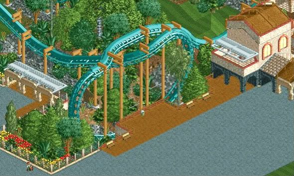
Don't know what's up with the quality of the image, it's kind of blurry. -

 Xophe
Offline
Good stuff! Can you do something with the supports though? They're kind of crazy haha! And maybe stick to just one colour for the flowers (eg yellow?). I like your tree-ing and that little viewing area is a nice touch.
 Tags
Tags
- No Tags


