(Archive) Advertising District / Dump-Place
-
 19-April 07
-

 Ling
Offline
You guys know that park was released years ago, right? I have to agree with tyandor though, and it's a brilliant example. It's not even nostalgia really... when I look at older NCSO and CSO RCT2 parks, I just have more fun. If I'm impressed, it's because of the scale, not the technical detail, but the colors and sheer raw atmosphere of the older parks are somehow just not seen anymore. It's something I've noticed and tried to work around, but I know my work has never even really been at par, in any respect. It's very hard to do anything at that level now, though, because if you show anyone in bits and pieces, it's not going to look detailed enough - it's the macro effect that really sells it. I'm not sure why we're more drawn to that than more "modern" work.
 -

 Sephiroth
Offline
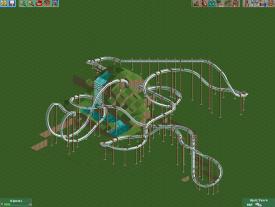
Looks pretty. Not a fan of the "left-hand curve, left-hand helix, left-hand helix, right-hand turn, left-hand turn, left-hand helix, left-hand-turn-into-break-run" thing going on though.
 -

 nin
Offline
I definitely would like to see another inversion in there, but it's not bad. Finish more plz.
 -

 Cocoa
Offline
Nah I love it. very different and original. I'd love a floater hill like that on an invert (actually, that would make a much better flyer)
 -

 Recurious
Offline
Love that layout. My favourite element is definitly the helix/curve thingy after the first drop, before it goes into the mountain. Not to keen on the 2 curves before the brakerun but it's not that disturbing. Nice layout.
 -

 Hex
Offline
I don't know why everyone is going gaga over the layout. Yeah it looks nice, but it turns left like 95% of the time.
-S.C. -

 BelgianGuy
Offline
this was my pt work till motivation hit rock bottom due to work and other time consuming stuff

-

 Cocoa
Offline
I love it! I've always thought that flyer track just looks too big for a zamberla flyer. But oh well, not much else you can do
 Tags
Tags
- No Tags


